Catalyst
Mobilizing virtual volunteerism.
PROJECT OVERVIEW
Catalyst is a mobile app that aims to provide virtual volunteer opportunities that are curated to volunteers' passions and skill-sets.
This is an educational project that stemmed from my curiosity in ways we can help contribute to society.
ROLE
Research, UX Design, Branding, Prototyping, User Testing
TEAM
Sole UX Designer
DURATION
4 Weeks
TOOLS
Figma, Adobe Illustrator
PROBLEM
Virtual volunteerism is on rise, but many do not know where to go to find opportunities.
The younger generation wants to help, but they want to apply their skills to volunteering.
Many often find themselves "too busy" to volunteer and do not want to go out of their way to commute to far away location.
GOALS
Create a platform that is dedicated to virtual volunteerism with opportunities catering to a variety of time committments.
Have a way for users to customize their volunteer opportunities based on their preferences.
Communicate to volunteers that they are making an impact with their activities.
MY APPROACH
Including an onboarding questionnaire that allows volunteers to select their skills and causes.
Having filter options for time length, projects, and events.
A profile screen that details the users impact and tracks their volunteer opportunities.
MARKET RESEARCH
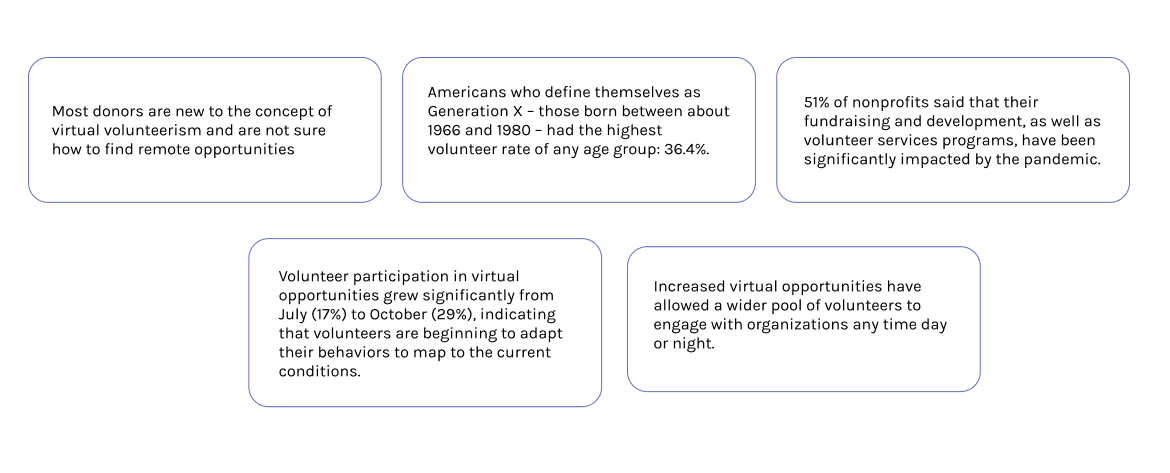
Learning about the effects of the pandemic on volunteering opportunities
Due to the ongoing pandemic, in-person volunteer activities have drastically decreased. Non-profits have attempted to continue these activities through a variety of virtual projects, events, and fundraising. However, many are unfamiliar with the virtual volunteering space and do not know where to find these. Some are hesitant to participate due to unclear expectations.
In the most recent years, Millenials and Gen Z have expressed a greater desire to be socially active and aware of the different ways they can contribute . As career-oriented individuals, skill-based volunteer opportunities would be fitting for the younger generations.
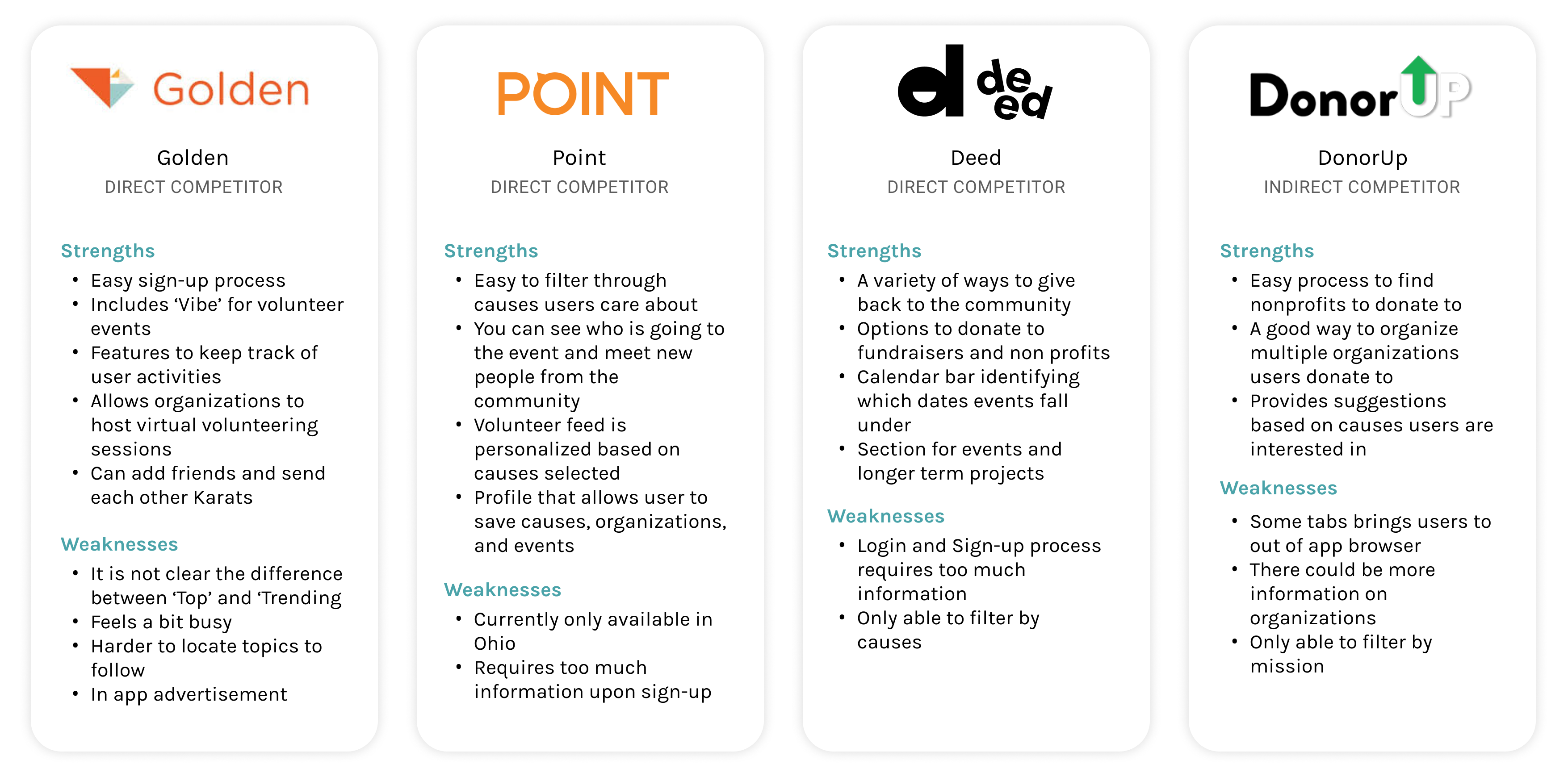
COMPETITIVE ANALYSIS
How do other apps connect volunteers with opportunities?
Going through popular volunteer apps, all offer in-person activities as well as virtual opportunities. Currently, Golden is the only one that allows an easy way to filter through these opportunities and there is no app solely dedicated to virtual volunteer opportunities. Users appreciate a variety of filtering capabilities to tailor their searches based on their preferences. The most common frustration amongst most of the reviewed apps is a lengthy sign-up process with no clear indication of what the app offers.
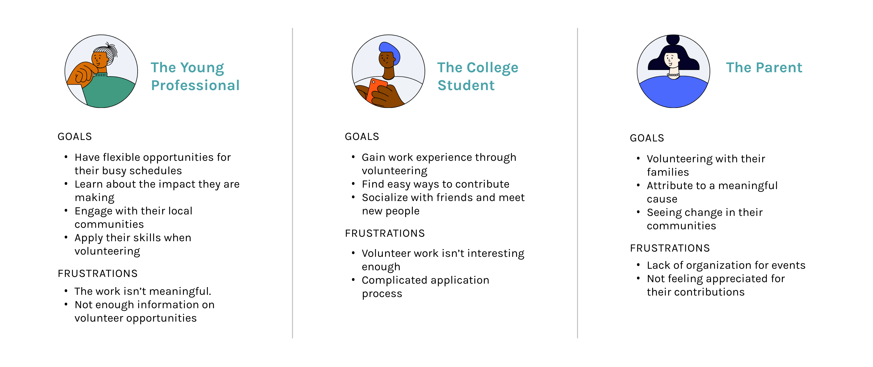
PROVISIONAL PERSONAS
Focusing on making volunteer opportunities available to a younger demographic
Reviewing market research, the younger generation is more concerned with activism and want to get involved. They are also avid learners and strive to volunteer in ways they can apply their skills. I created provisional personas to guide my interview recruiting process, while focusing on 'the young professional' and 'the college student'.
USER INTERVIEWS
Understanding why and how volunteers choose opportunities they want to partake in
Interview participants with experience volunteering in-person and virtually were recruited to learn about their experiences while volunteering. I focused on gathering as many stories as possible from positive, negative, and memorable experiences in hopes to identify their motivations and feelings towards volunteer work.
Research Goals:
- Why do users want to volunteer?
- How do users decide what volunteer opportunities to partake in?
- How do users find their volunteer opportunities?
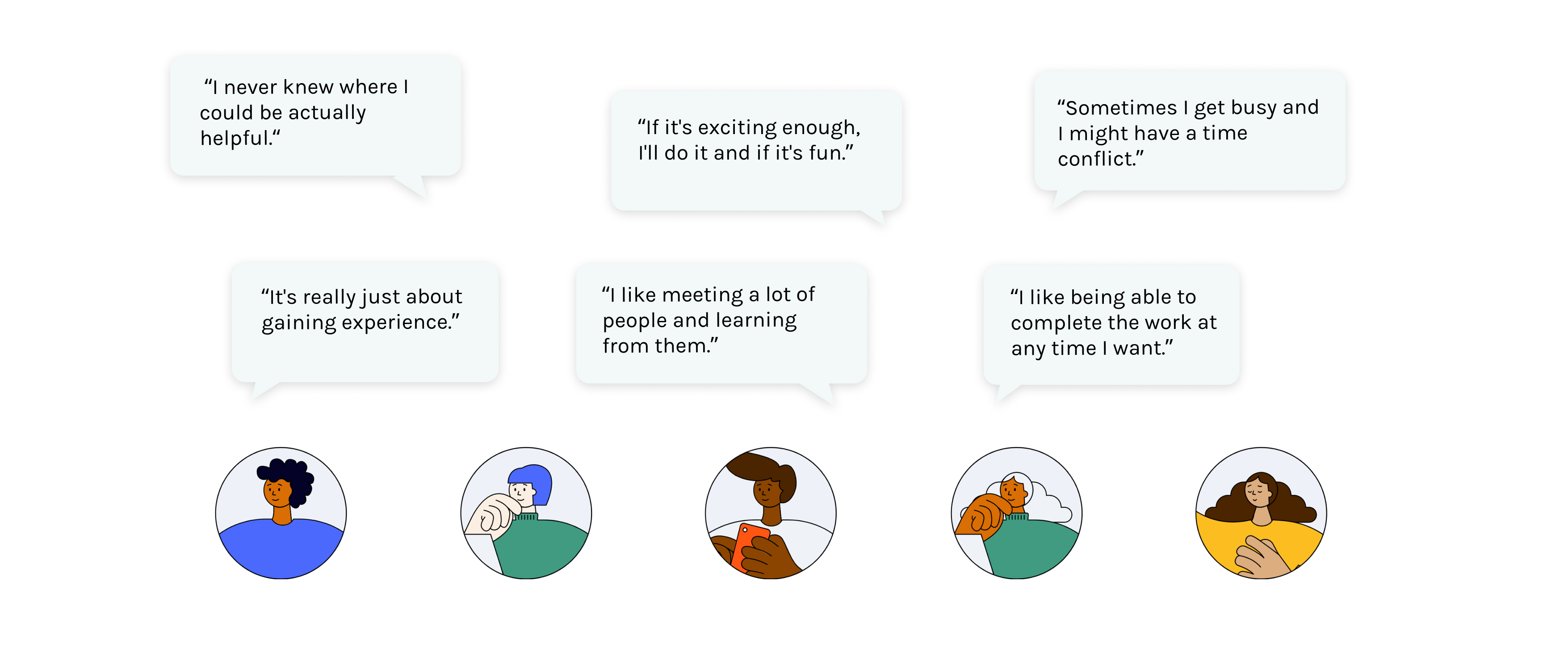
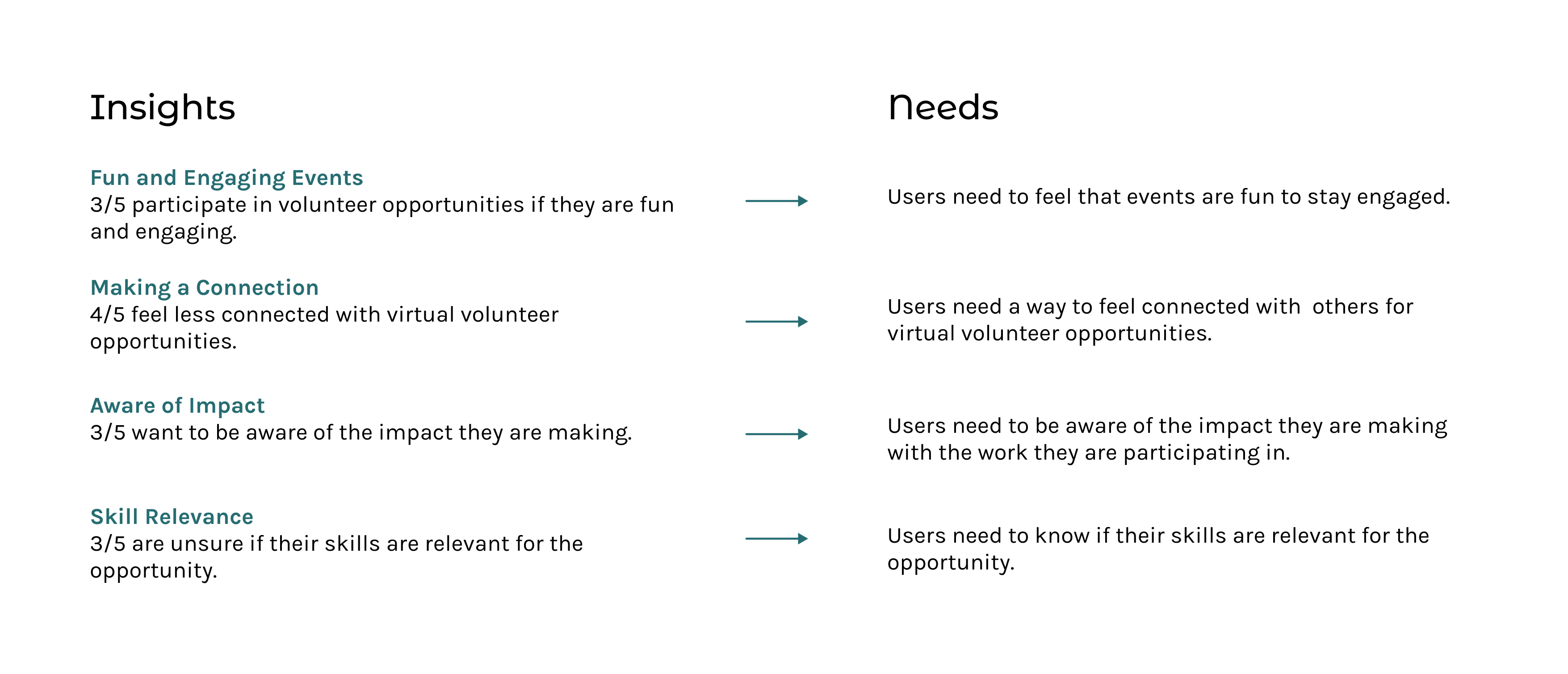
Key takeaways from user interviews
From my interview results, I identified common frustrations that participants expressed when discussing their volunteer experiences. I translated the insights into needs that would minimize these frustrations.
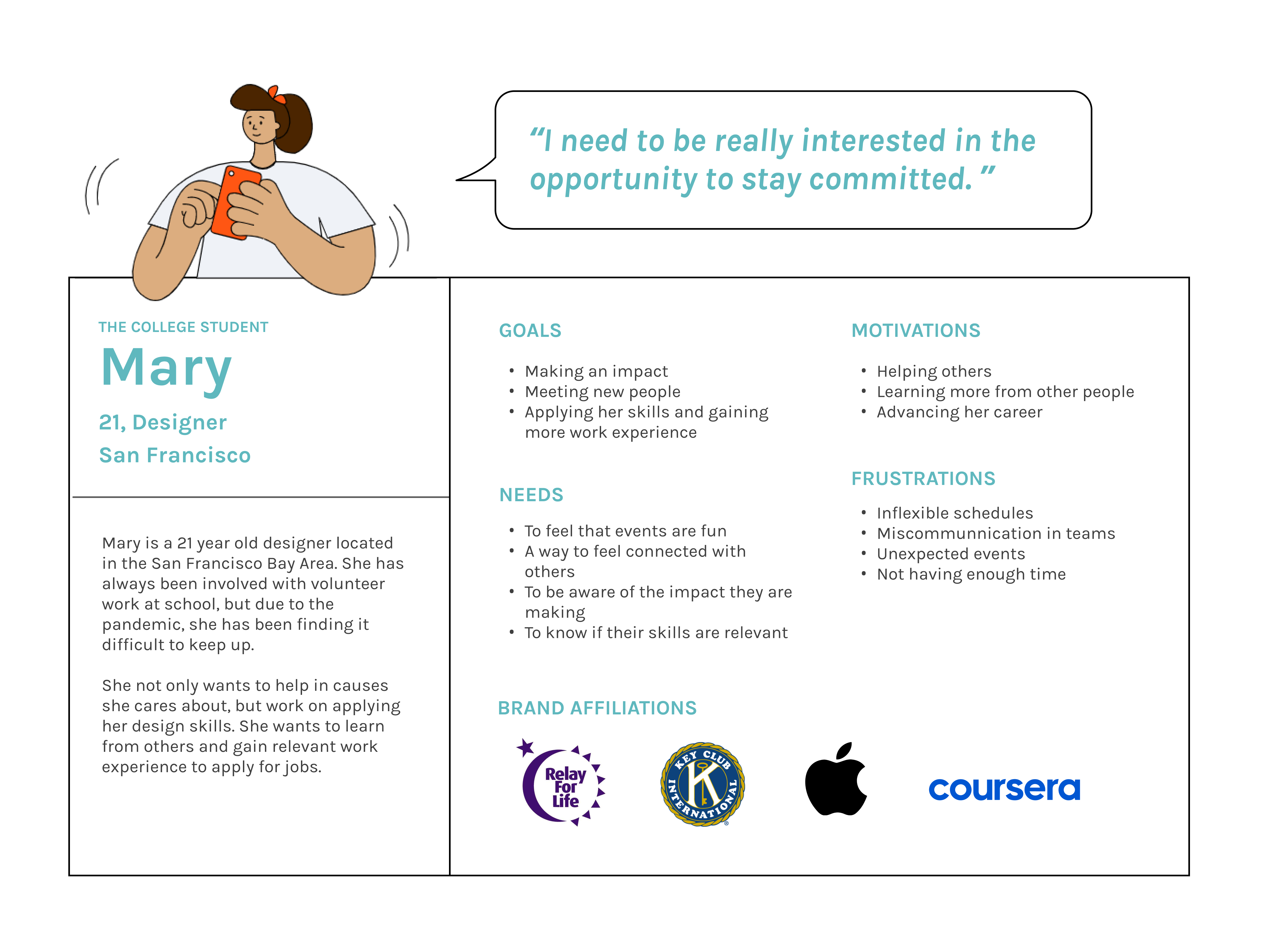
DEFINE
Designing with a user persona in mind
Patterns and insights drawn from my interviews were applied to create a primary persona, Mary. Mary is a college student who truly wants to make an impact, but given her busy schedule, she is prioritizing her studies and career. She would love to find opportunities that are fun and fit her skill sets.
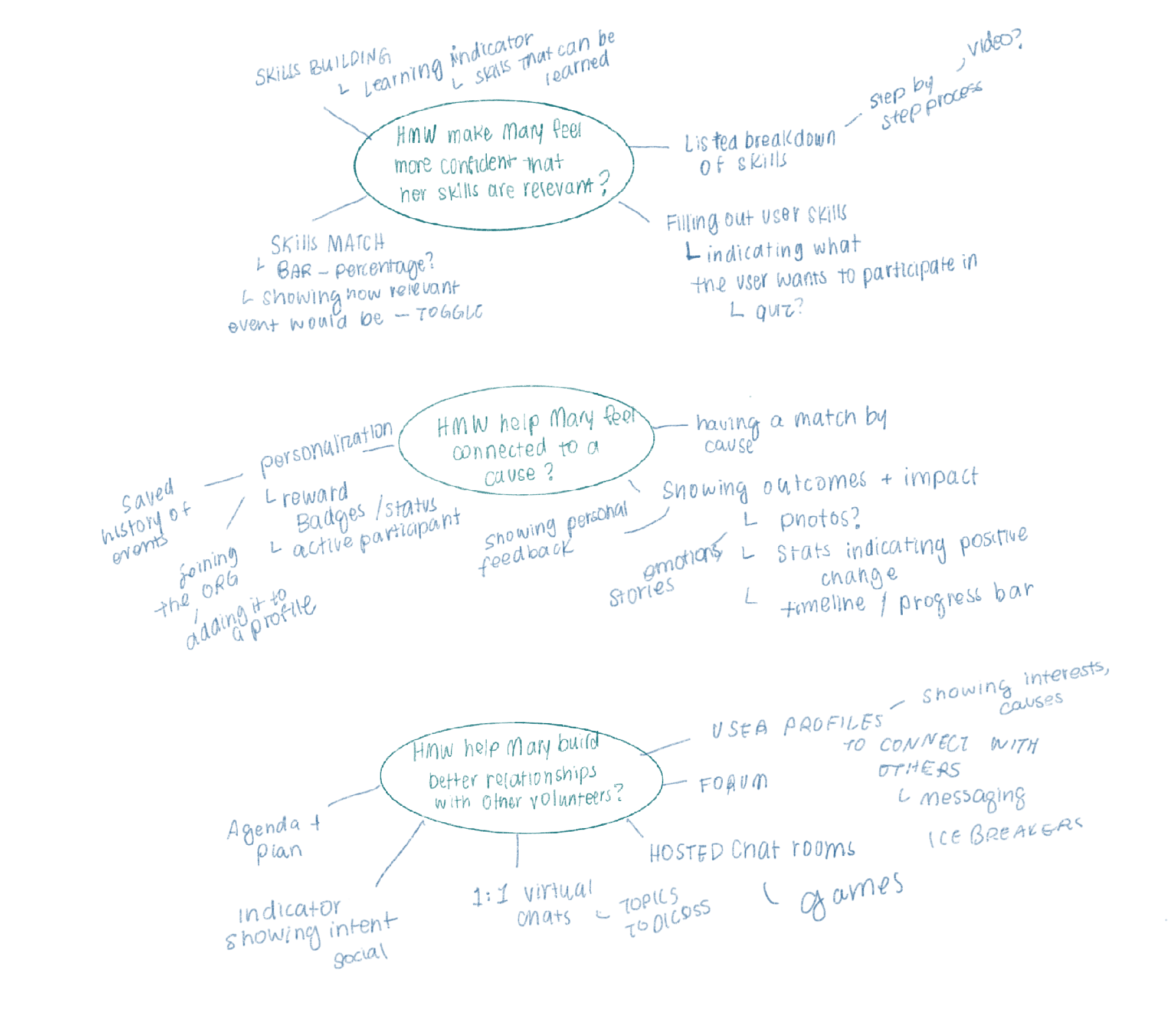
MIND MAPPING
How might we help Mary find volunteer opportunities?
Based on the needs of Mary, ‘How might we’ questions were created to to guide my brainstorming sessions.
Assessing the features impact and effort, I decided to move forward with:
- User onboarding for skills and causes
- Filters by time length, skills, and causes
- User profile detailing the personal impact and volunteer history
- Volunteer opportunities showing the clear breakdown of the step-by-step process.
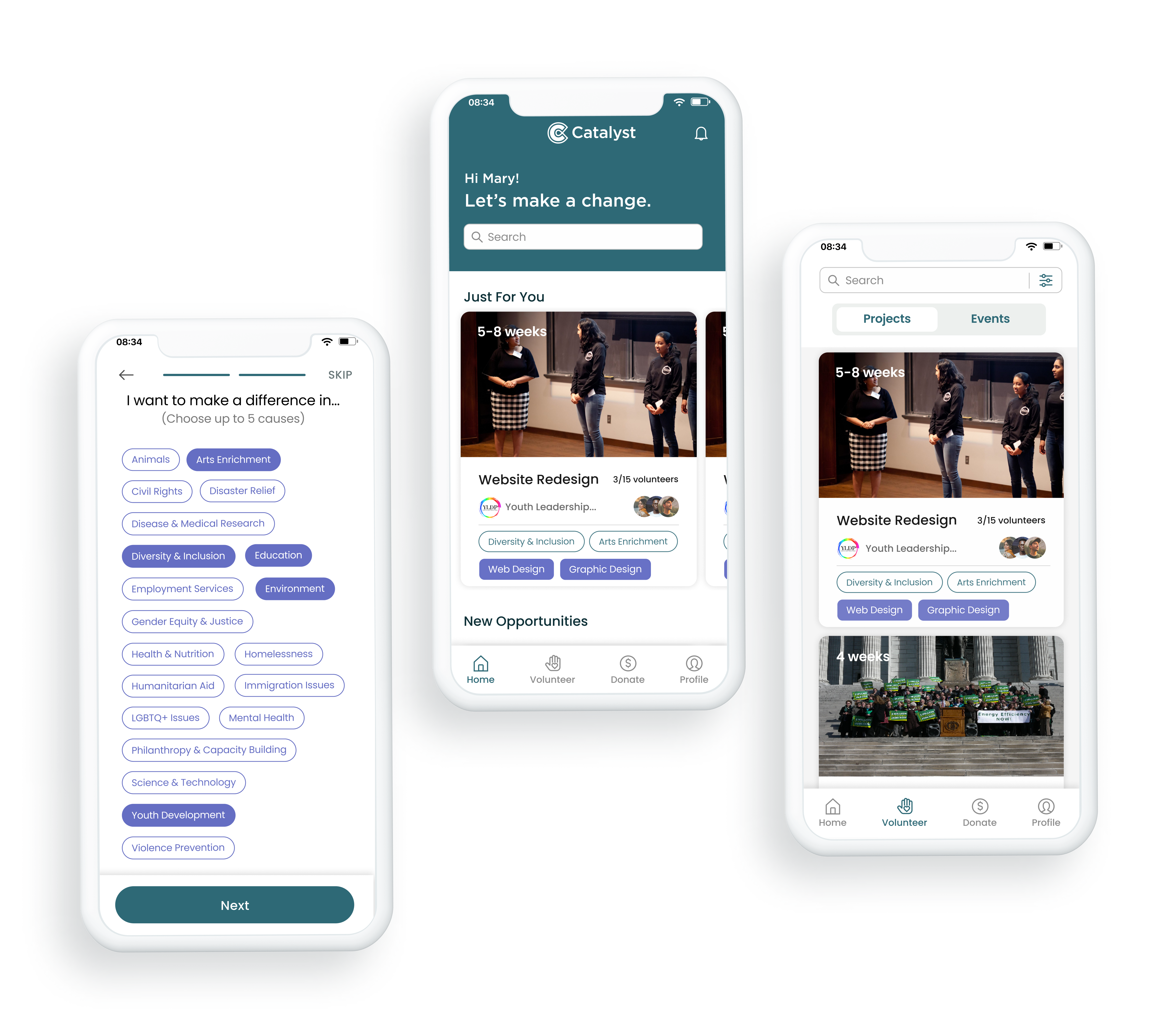
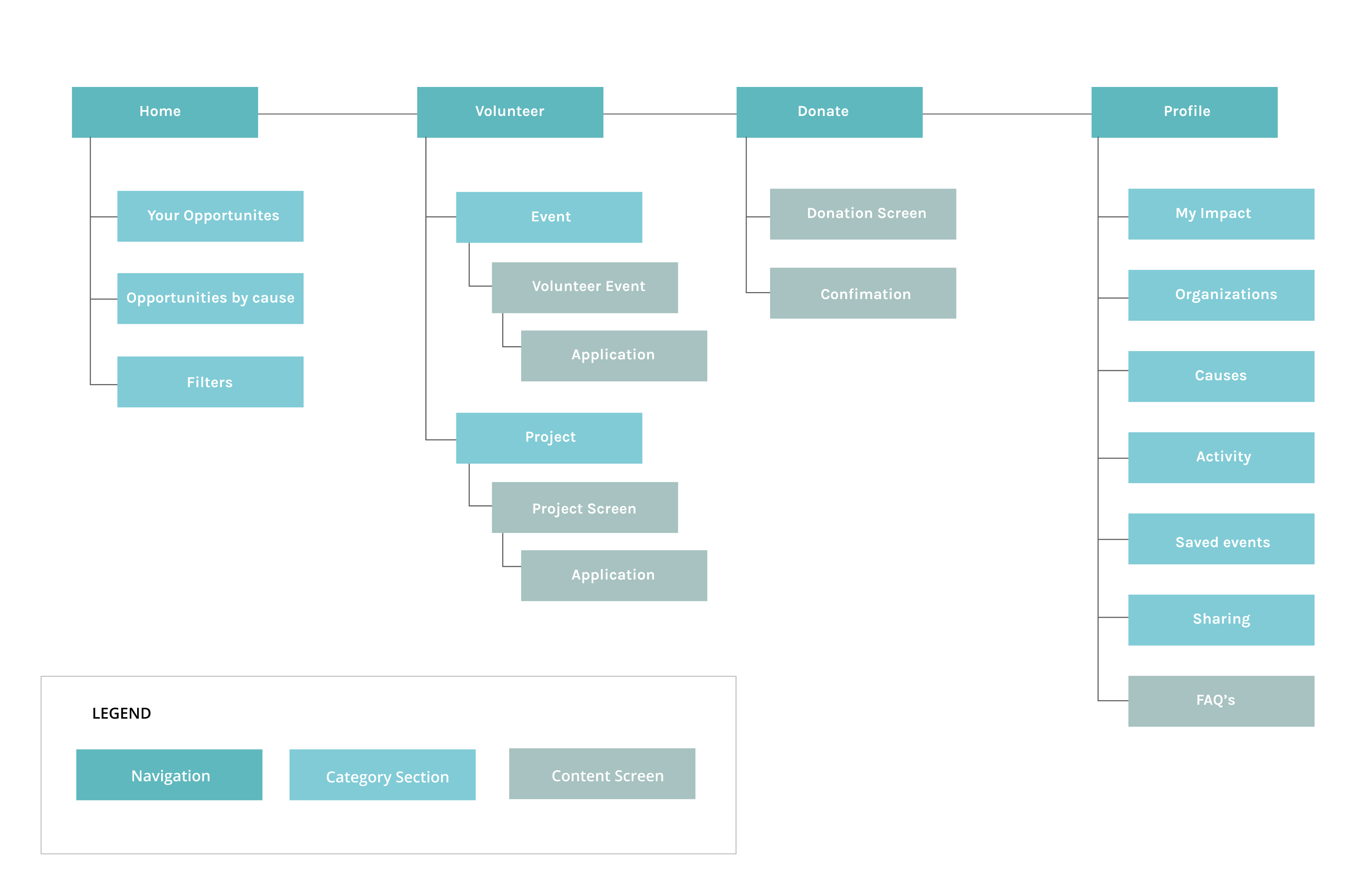
INFORMATION ARCHITECTURE
Laying out the information architecture with reference to competitor apps
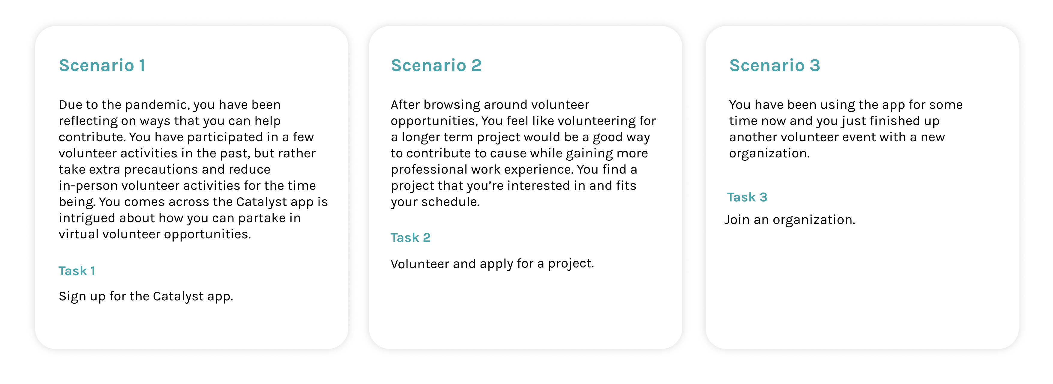
The app's information architecture was mapped out based on competitor apps and features to be integrated. The Home screen would contain volunteer opportunities based on the users' selected preferences, while the Volunteer screen would contain a search and filtering for opportunities. I also included a donate portion to the app, as Mary might be interested in donating to a cause instead of volunteering her time due to busy scheduling.
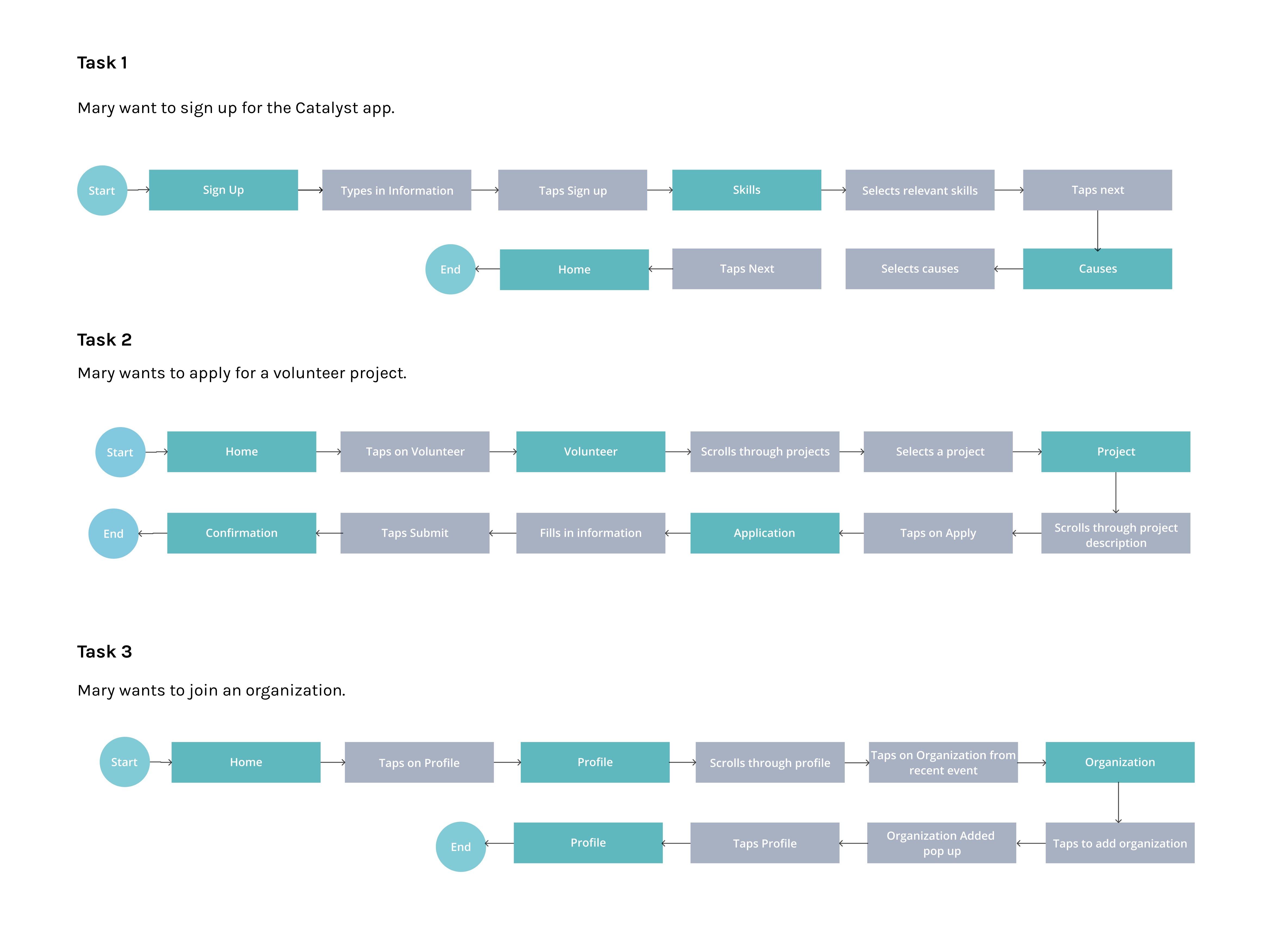
Tasks were created based on different scenarios Mary would be using the app: when she is first introduced to app, when she finds her first project to apply to, and joining an organization after she has used the app for some time.
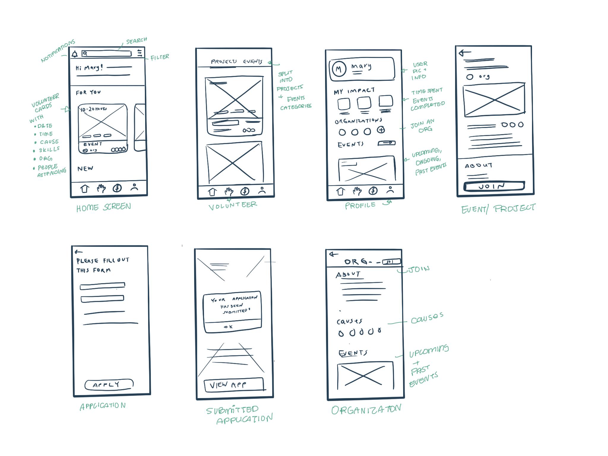
INTERACTION
Sketching out screens to detail app navigation
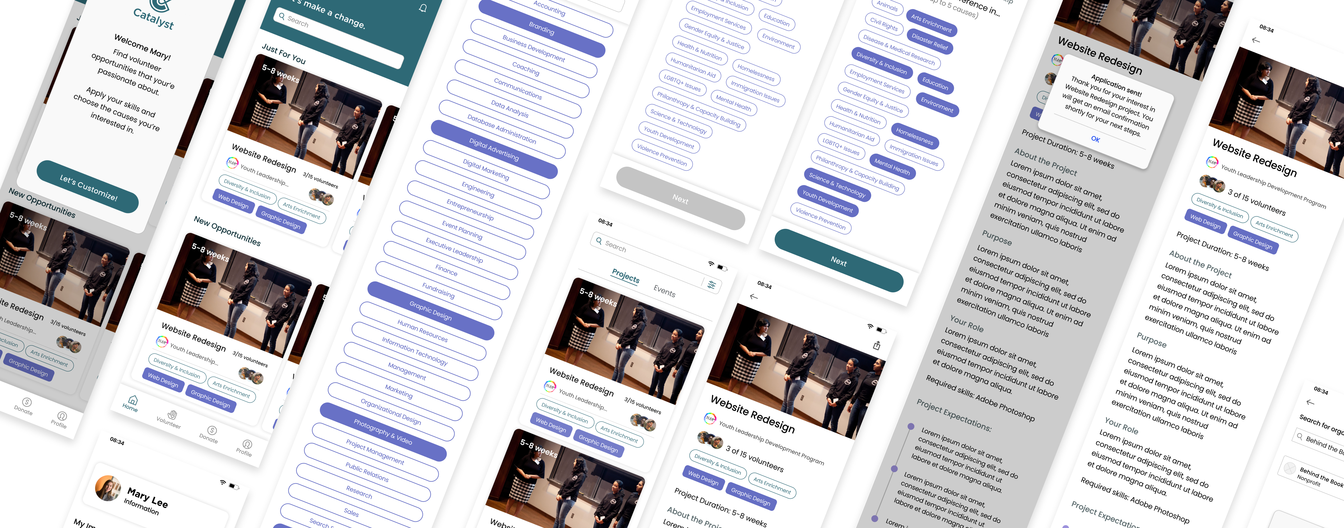
Following pre-exisiting UI patterns and elements, I sketched out the screens and the navigation through the app. The 'Home Screen' would have opportunities based on the users selected preferences during onboarding. The 'Volunteer Screen' would be broken down into 'Projects' and 'Events' and can be filtered based on time commitment. The "Profile" screen would allow the user to view their overall impact, track their volunteer opportunities, and join organizations.
VISUAL DESIGN
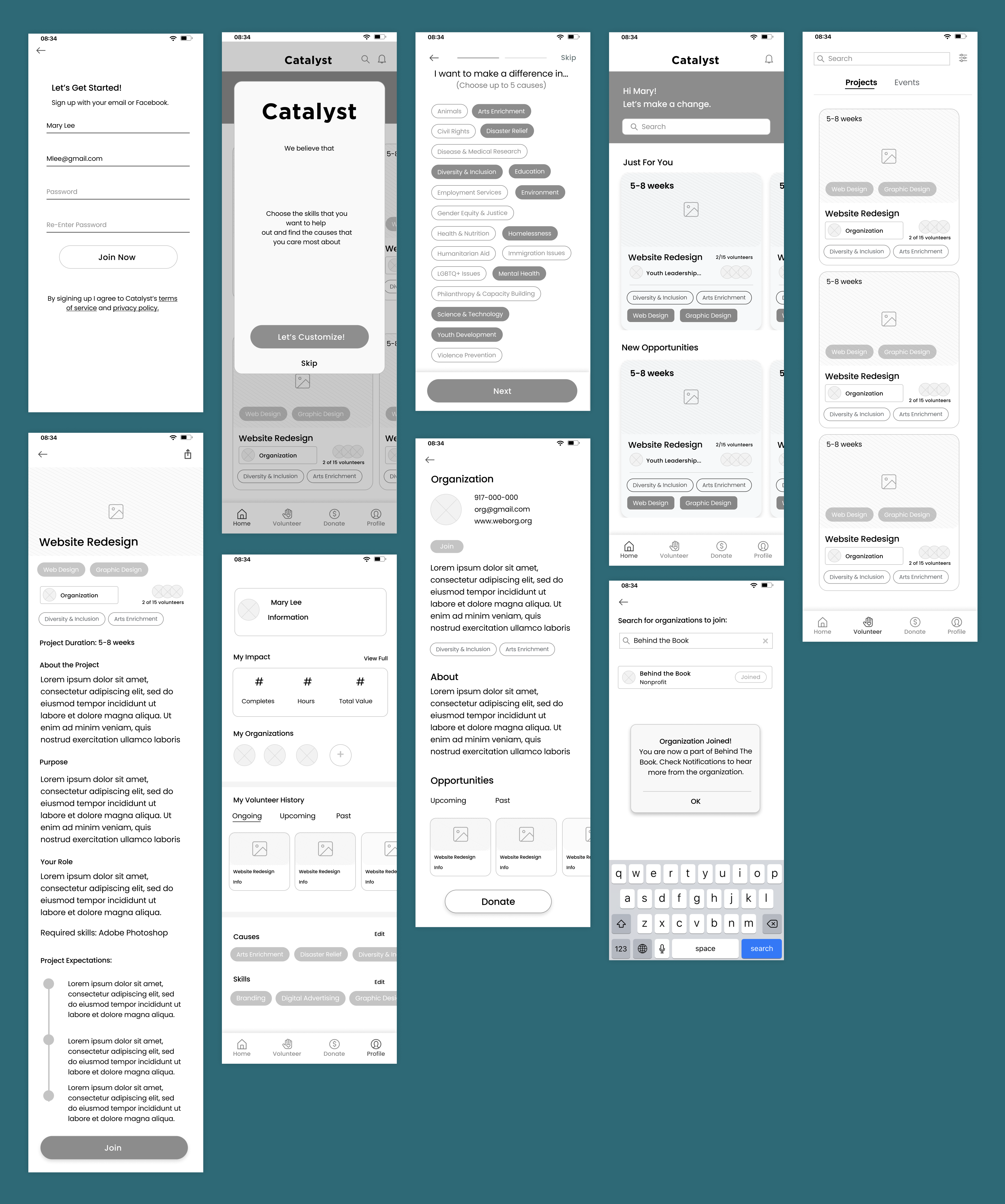
Creating Mid-Fidelity Wireframes for early testing
Building from the my low-fi sketches, I created mid-fidelity wireframes to prototype and test, iterate and identify possible areas of confusion before investing time into hi-fidelity wireframes.
TEST
Putting the design to the test
Objectives:
- Identify if there are any confusing UI elements and buttons.
- If there are any tasks prototyped that do not fit the user's mental models.
Identifying common areas of frustration
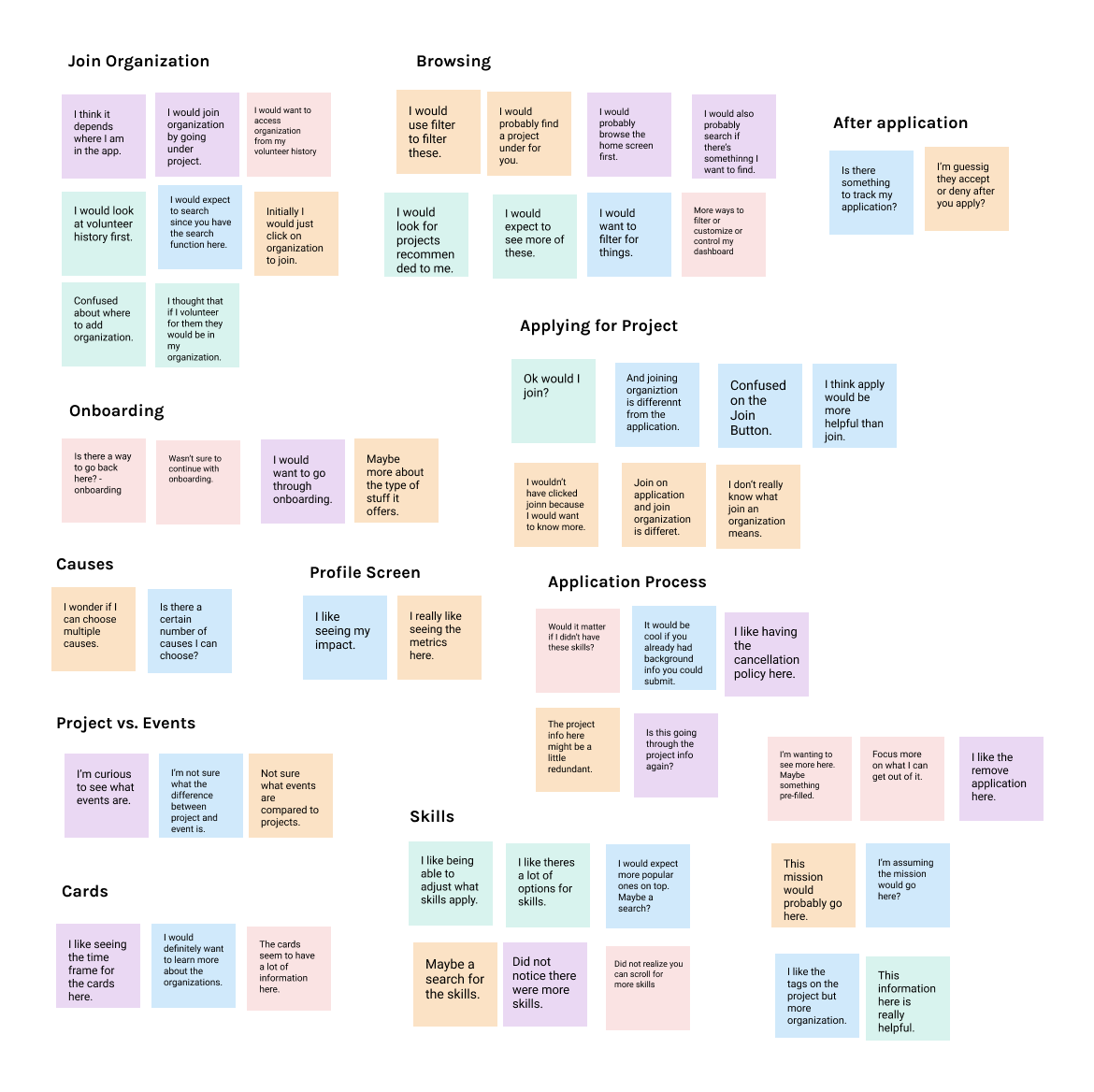
Insights
Users want more organization in list of skills.
3/5 thought that the large list of skills might be confusing.
The ‘Join’ button is confusing.
3/5 participants were confused by ‘join’ for the application vs. ‘join’ for an organization.
Users expect to add an organization by going on through a project screen.
3/5 participants would go to history to add an organization they previously worked with.
Users would rather filter rather than browse.
3/5 participants want to be able to filter or customize more.
Recommendations
Add a search to organize the list of skills.
Change ‘Join’ to ‘Apply’ for applications.
Add organizations under Volunteer History cards.
Add filtering screen to show how projects, events would be filtered.
VISUAL DESIGN
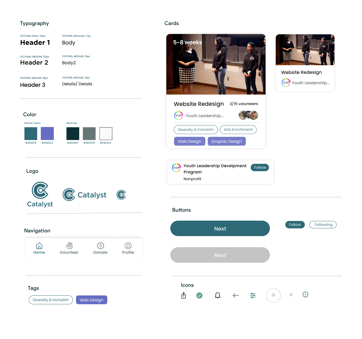
Building a brand that invokes "fun", "Friendly", "retro"
Since the app would be geared towards the young professional demographic, I opted for text and colors that represented fun, friendly, simple, and retro.
ITERATE
Making iterations and refining the overall look and feel of Catalyst
After making changes to my mid-fidelity wireframes, I added in the visual elements and color for the final hi-fi prototype.
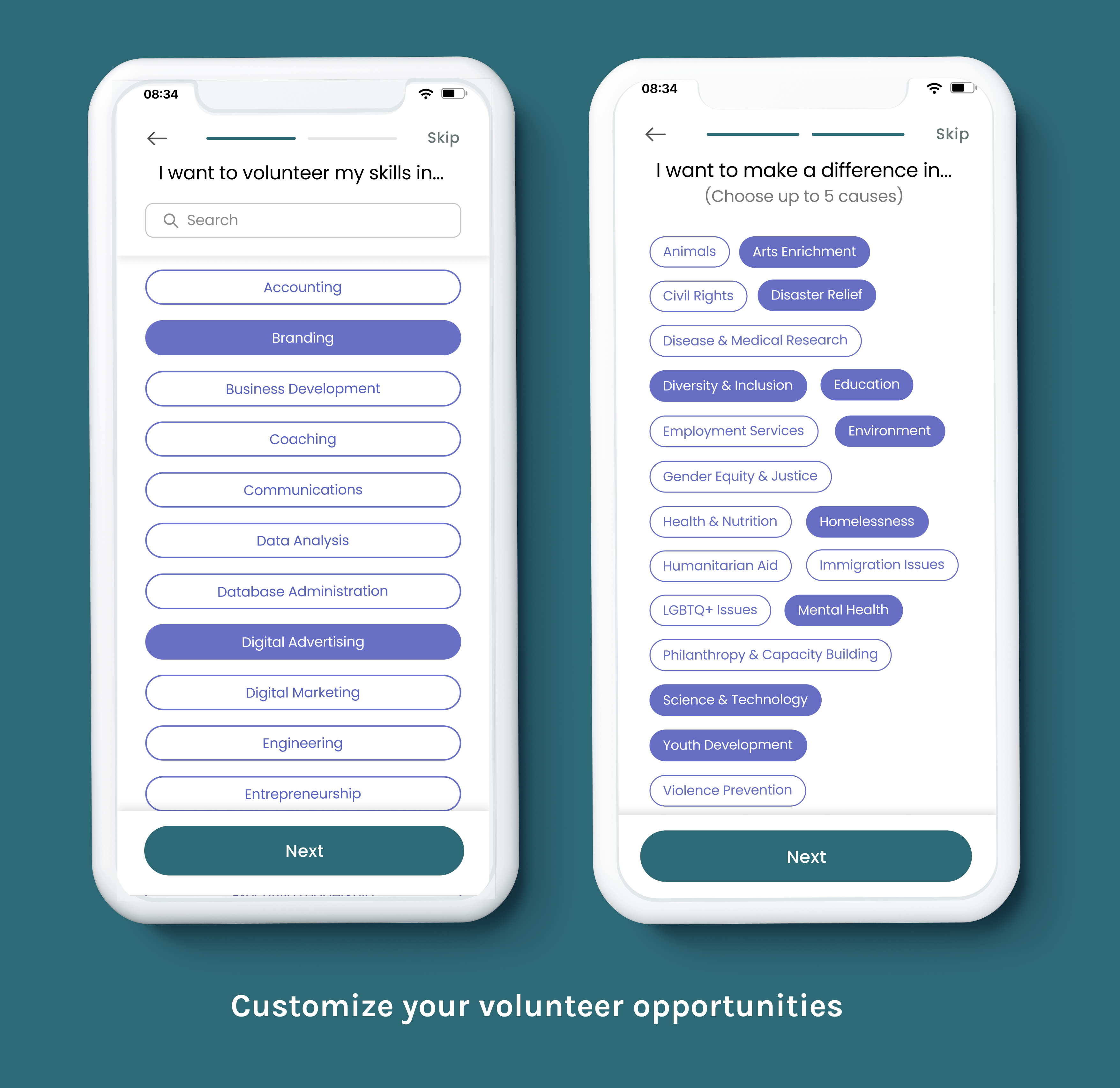
Having a search functionality for a long list of options.
I added a search bar, so users can search for the skills they want if they have a specific skill set in mind.
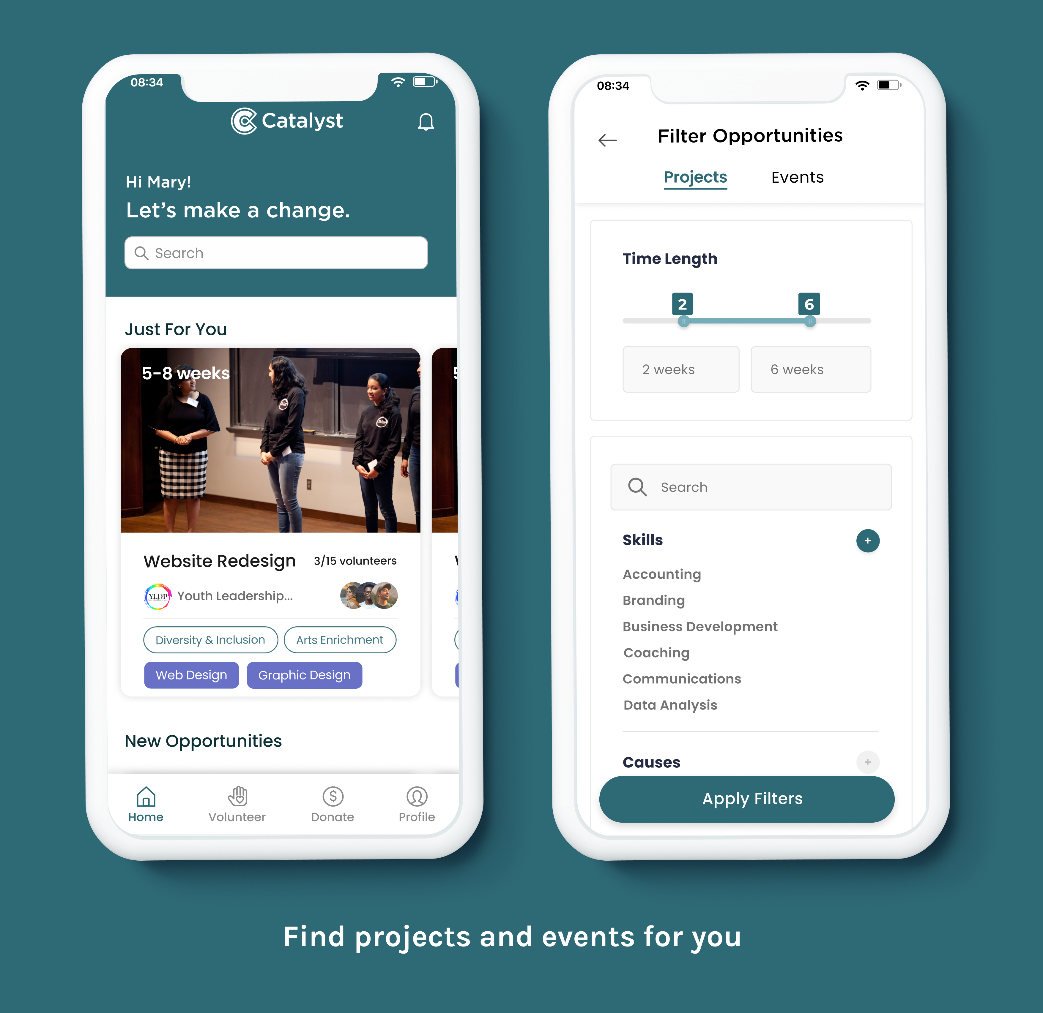
Filtering for opportunities
A search bar was also added to the home screen to easily find more volunteer opportunities. Filtering categories were also built out.
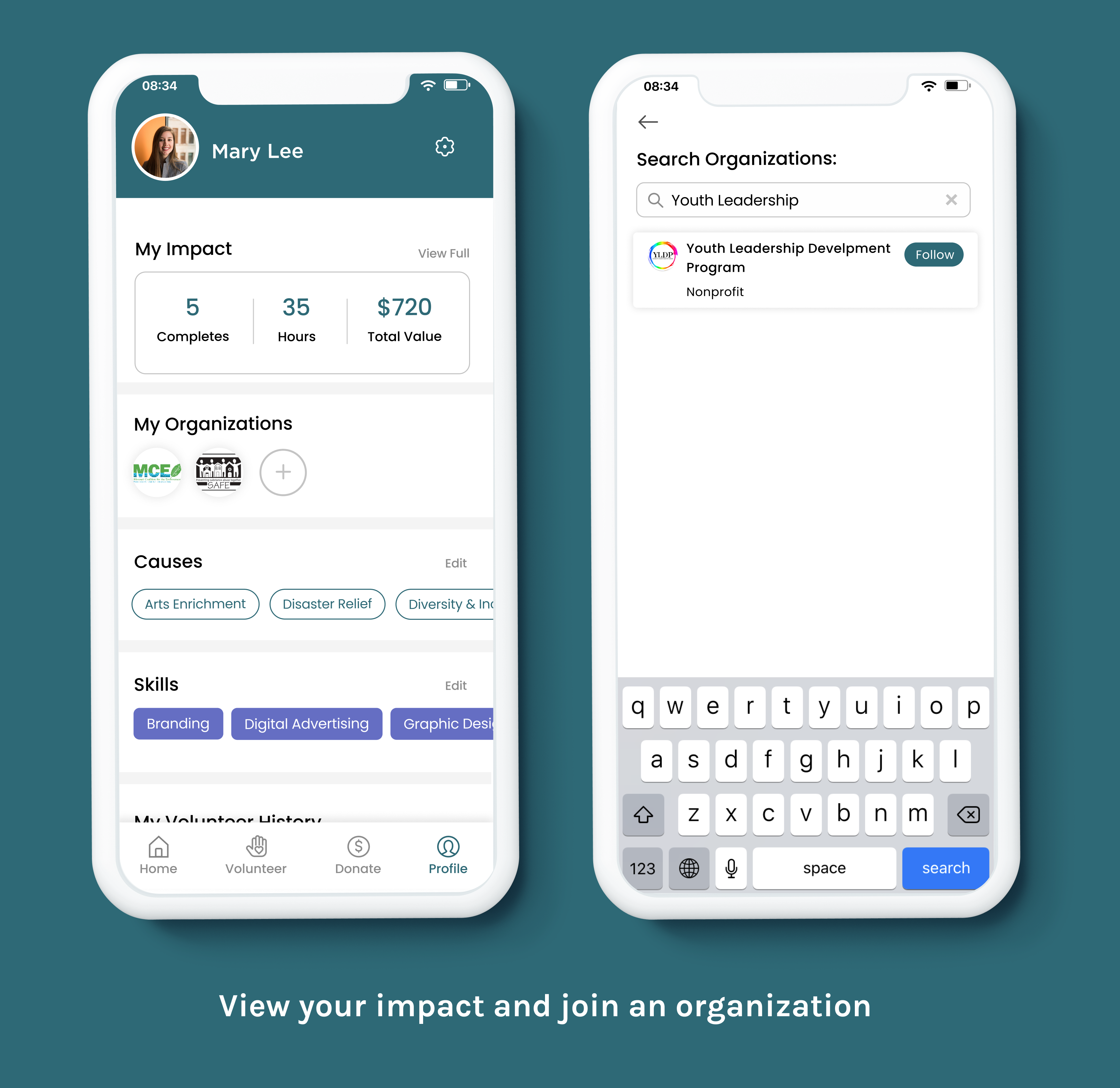
Reorganizing the profile cards
Users can tap on the cards in their volunteer history to access an organization page, where they can get more details and join.
LEARNINGS
In hindsight...
While building out an MVP for Catalyst, I had to constantly remind myself that I was designing for just enough features to be tested. Given the limited time constraints, it wouldn't be necessary to build out the entirety of the app, just what is important. When coming up with a concept, there's always this desire to come up with something 'orginal' and 'never done before', but in all honesty, there's already so much that has been presented to the world. Working on creating Catalyst, I really had to realign and prioritize what was important for the product.
If I had more time I would...
Test the hi-fi prototype
I would like to continue the testing process with testing the hi-fidelity prototype while adding some changes to the prior tasks. Filters are important for a feature for the app, so I would like to explore how users interact filters and which ones they would consider first in their search for volunteer opportunities.
Improve Acessibility
Accessibility was taken into consideration when designing hi-fidelity wireframes in regards to color contrasts and type sizes however, I would like to assess more closely the user's gestures when going through the app.
Integrate more social interaction
Something that volunteers voiced that they wanted more of from virtual volunteer opportunities was ways to connect with people. Having features where volunteers can add friends and interact with each other can build stronger relationships.
let's chat ฅ՞•ﻌ•՞ฅ
thanks for scrolling!
‧₊˚✩彡