ZOGO
Increasing engagement with leaderboard
Redesigning Zogo's leaderboard feature for users and clients
OVERVIEW
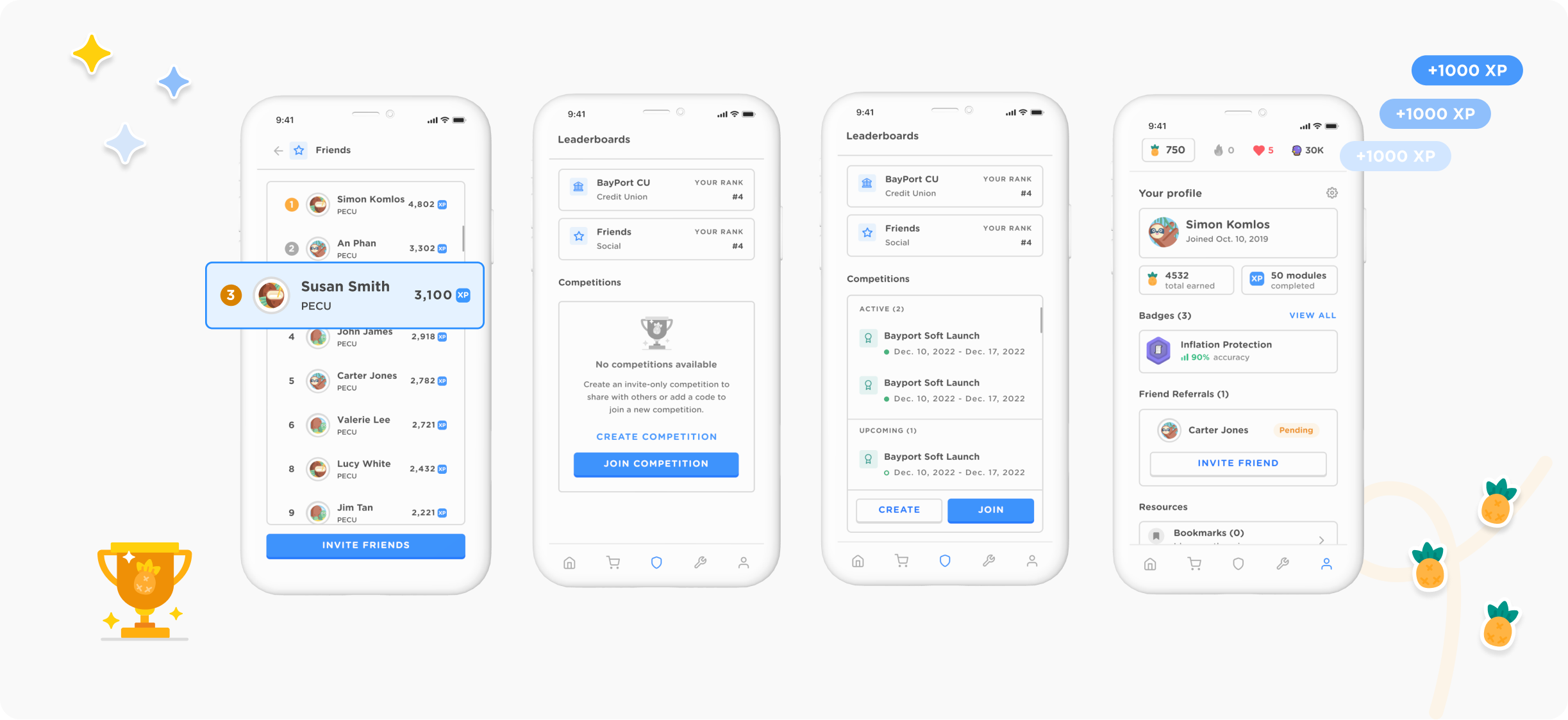
Zogo is a mobile app that helps users improve their financial literacy through bite-sized interactive learning modules and quizzes. To increase user engagement, I redesigned the leaderboard feature, allowing users to compare their achievements and allowing partners to create custom competitions.
MY ROLE
Responsible for research, design, user testing, and delivery.
THE TEAM
Product Designer
Product Manager
(3) Engineers
(2) Customer Success
DURATION
3 weeks
PROBLEM
- Clients wanted to use the leaderboard to designate winners for an allocated time period. The feature needed a redesign to improve user engagement, while reducing the lift for our CX team having to manually reset leaderboards for our clients.
- Zogo's current tabs were confusing and was not a cohesive experience across different versions of the app.
SOLUTION
- Implement a competition feature as an extension of a leaderboard. After a set timeframe, competitions would display top performers based on XP. Clients would be able to use this feature to select winners for their pre-launch period.
- Revise Zogo's current information architecture to accomodate all features.
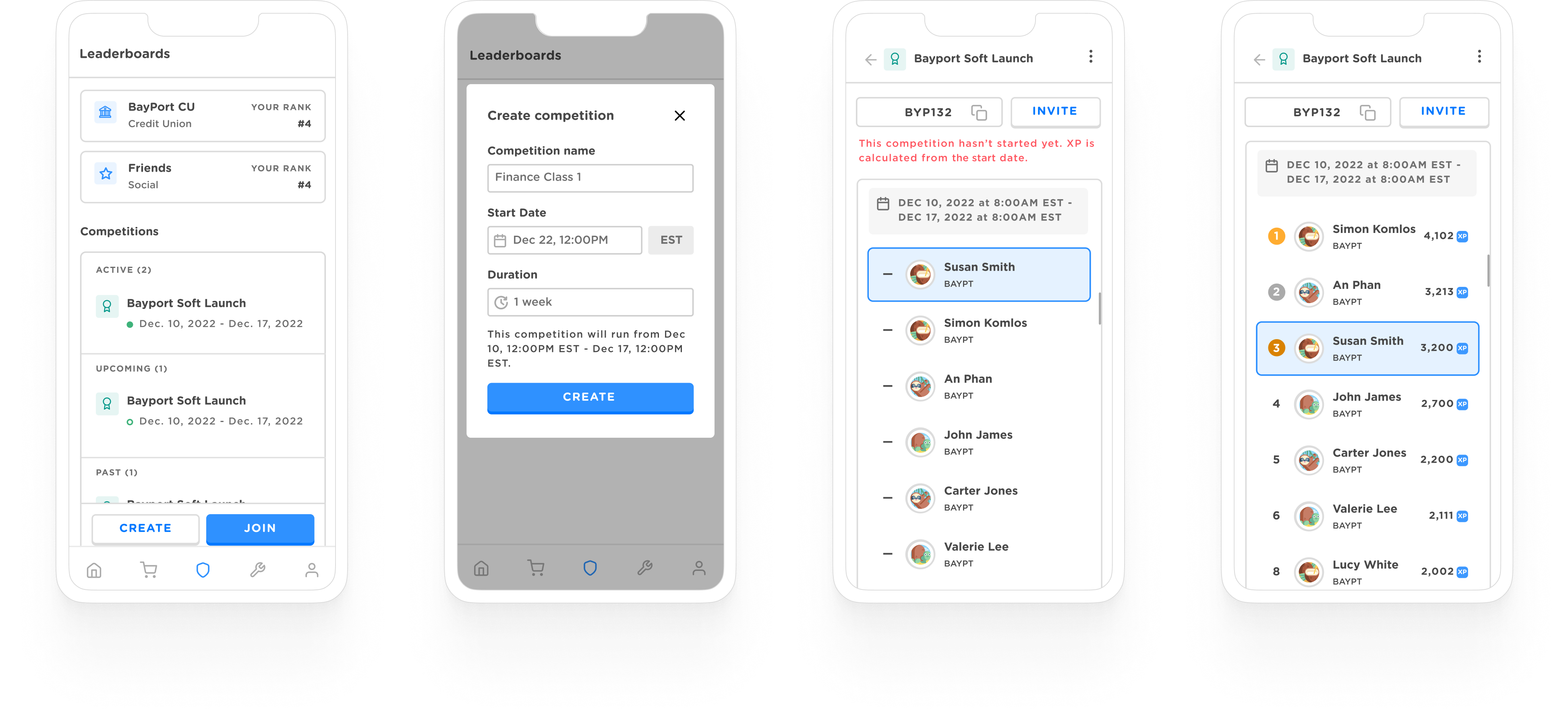
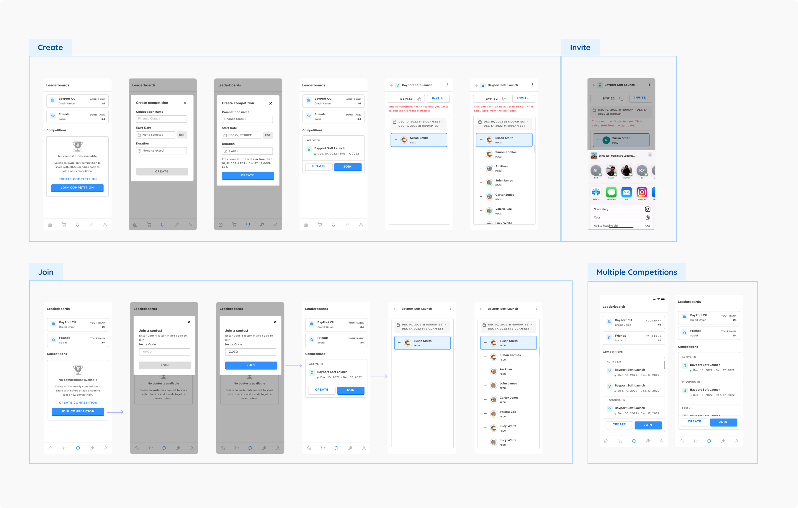
OVERVIEW OF COMPETITION FEATURE
BREAKING DOWN THE PROBLEM
Difficulty gauging progress
XP points are accrued on the day whenever a user joins, leading to unfair competition.
Confusing information architecture
Zogo has two versions of its app with different leaderboard features: The unsponsored version and the sponsored version.
Limitations in profile screen
Zogo’s current profile screen displays most of Zogo’s settings. There’s no clear area that displays a user’s friends list or tracks user progress.
STAKEHOLDER INTERVIEWS
Understanding our current flow and process
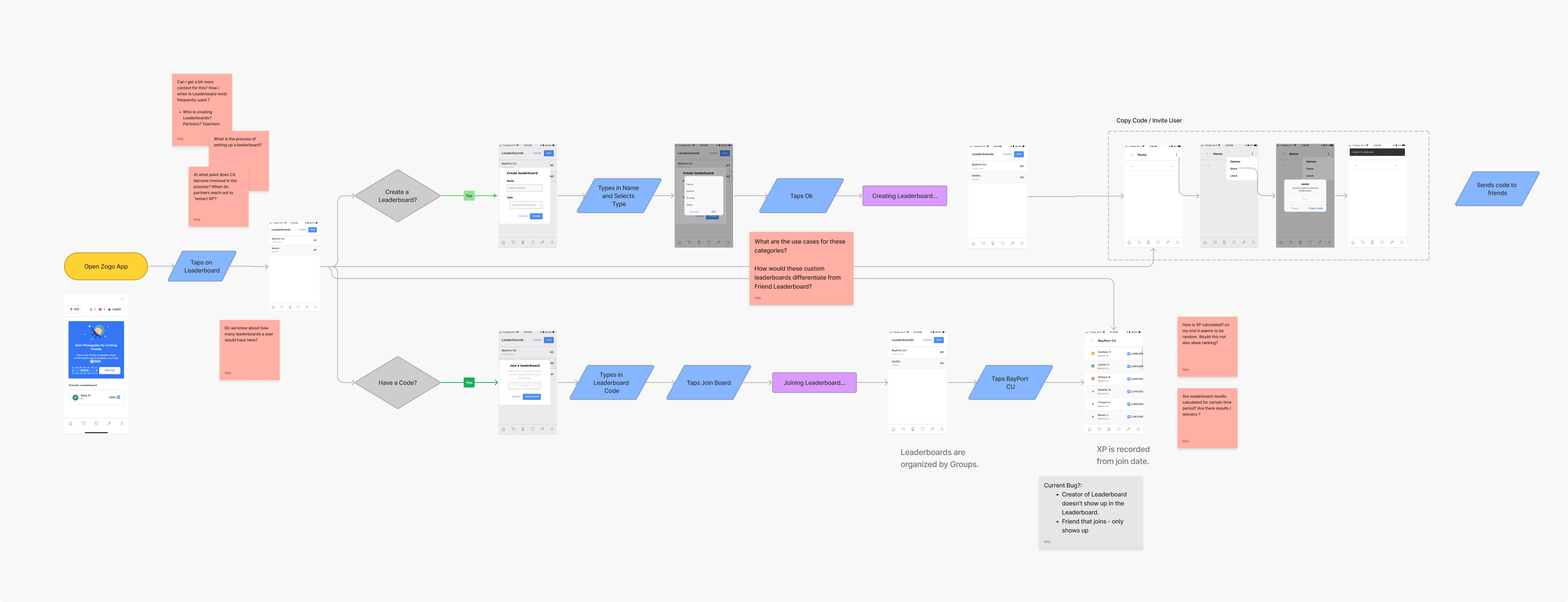
I collaborated with the CX team to get a better understanding of what our current flow is and a better understanding of the team’s interaction with our clients and different use cases for our leaderboard feature.
MARKET RESEARCH
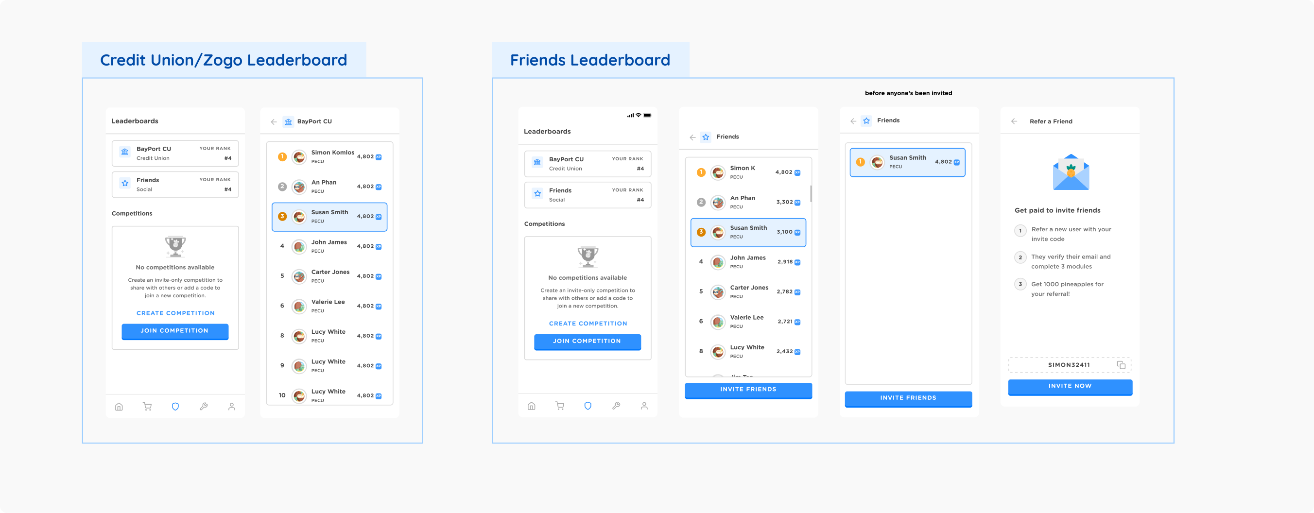
Identifying different types of leaderboards

Understanding these key leaderboard types is essential as we seek to integrate their elements into our project, ensuring a tailored and engaging experience for Zogo users and clients alike.
USER FLOWS
Putting together primary flows
I concentrated on refining the primary user flows within the leaderboard feature, encompassing tasks such as adding friends, creating contests, and joining contests. To enhance the overall user experience, I integrated a leaderboard view at the conclusion of each Zogo learning module, enabling users to easily track their standings.
Furthermore, the profile screen underwent a comprehensive redesign to accommodate the addition of a friends list. This presented an ideal opportunity to implement various smaller enhancements, elevating the overall usability of the profile interface.
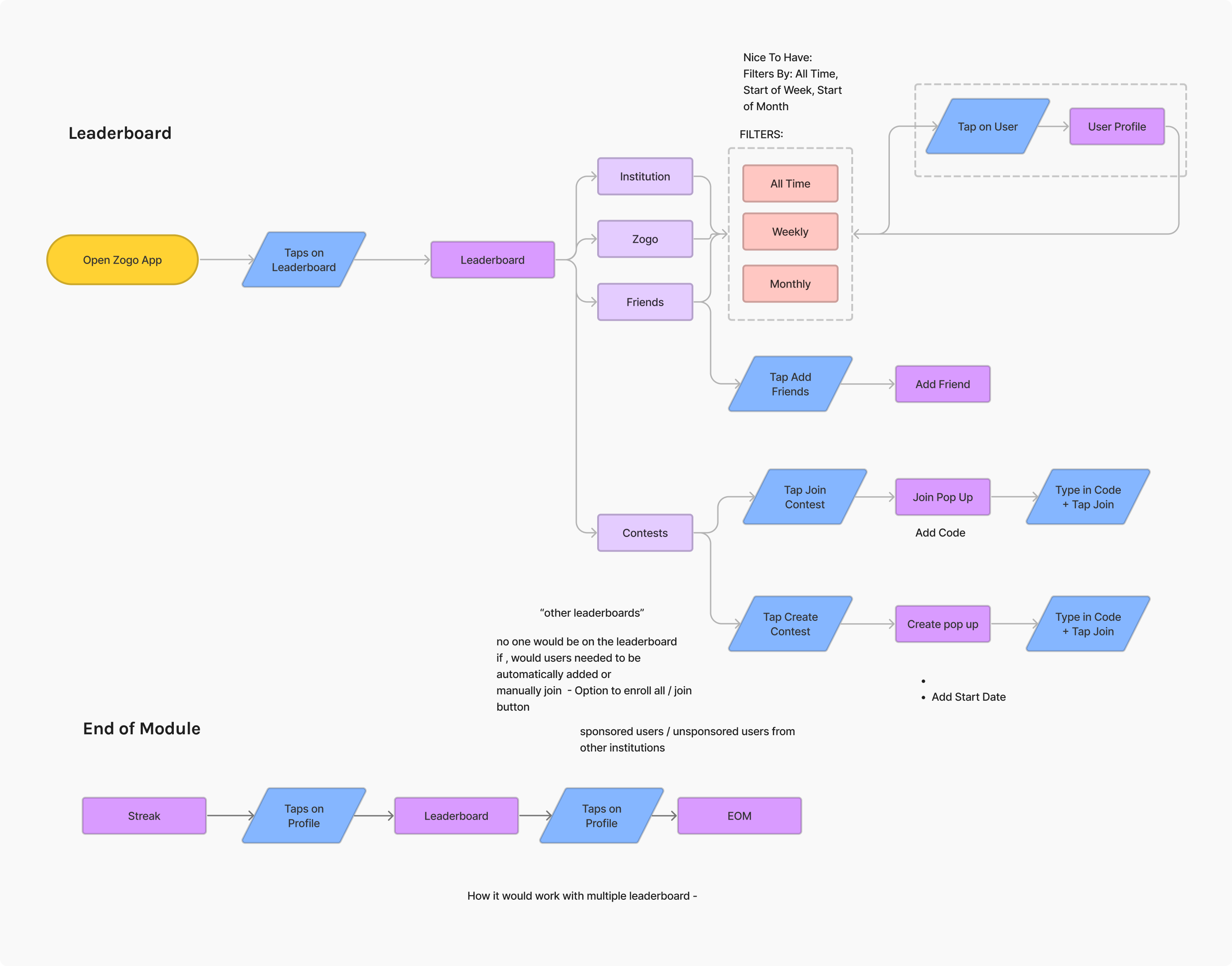
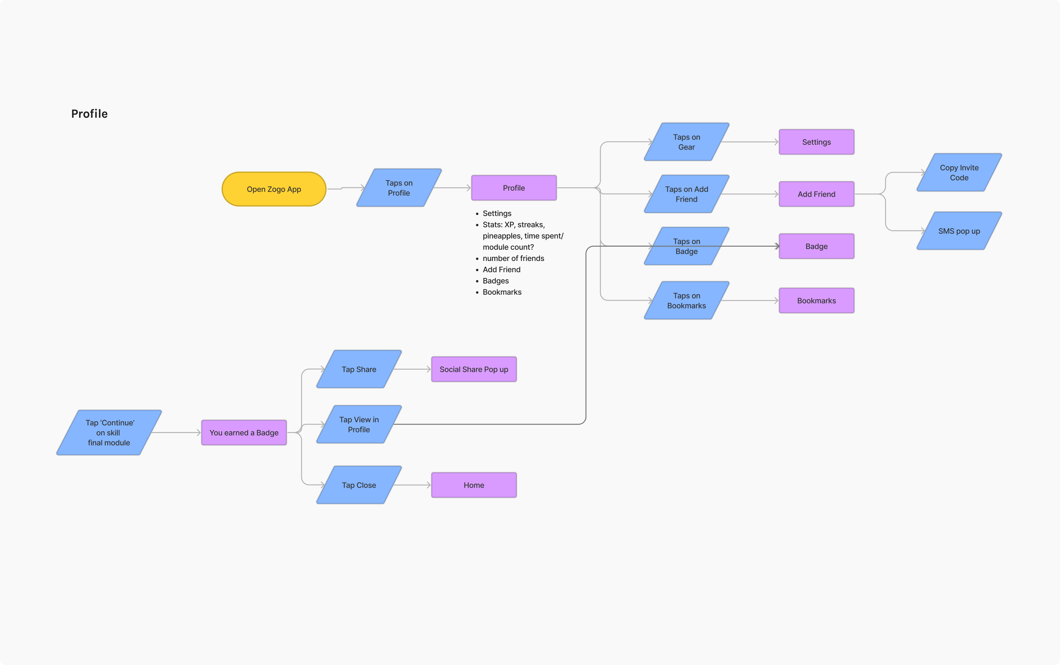
INFORMATION ARCHITECTURE
Improving navigation
Zogo has two app versions: Unsponsored and Sponsored. The Sponsored version, designed for financial partners, offers two leaderboards - one for friends and another for custom competitions. The Unsponsored version has only the friends leaderboard. To simplify and improve user experience, I merged these leaderboards, creating a more cohesive and unified experience for all Zogo users.
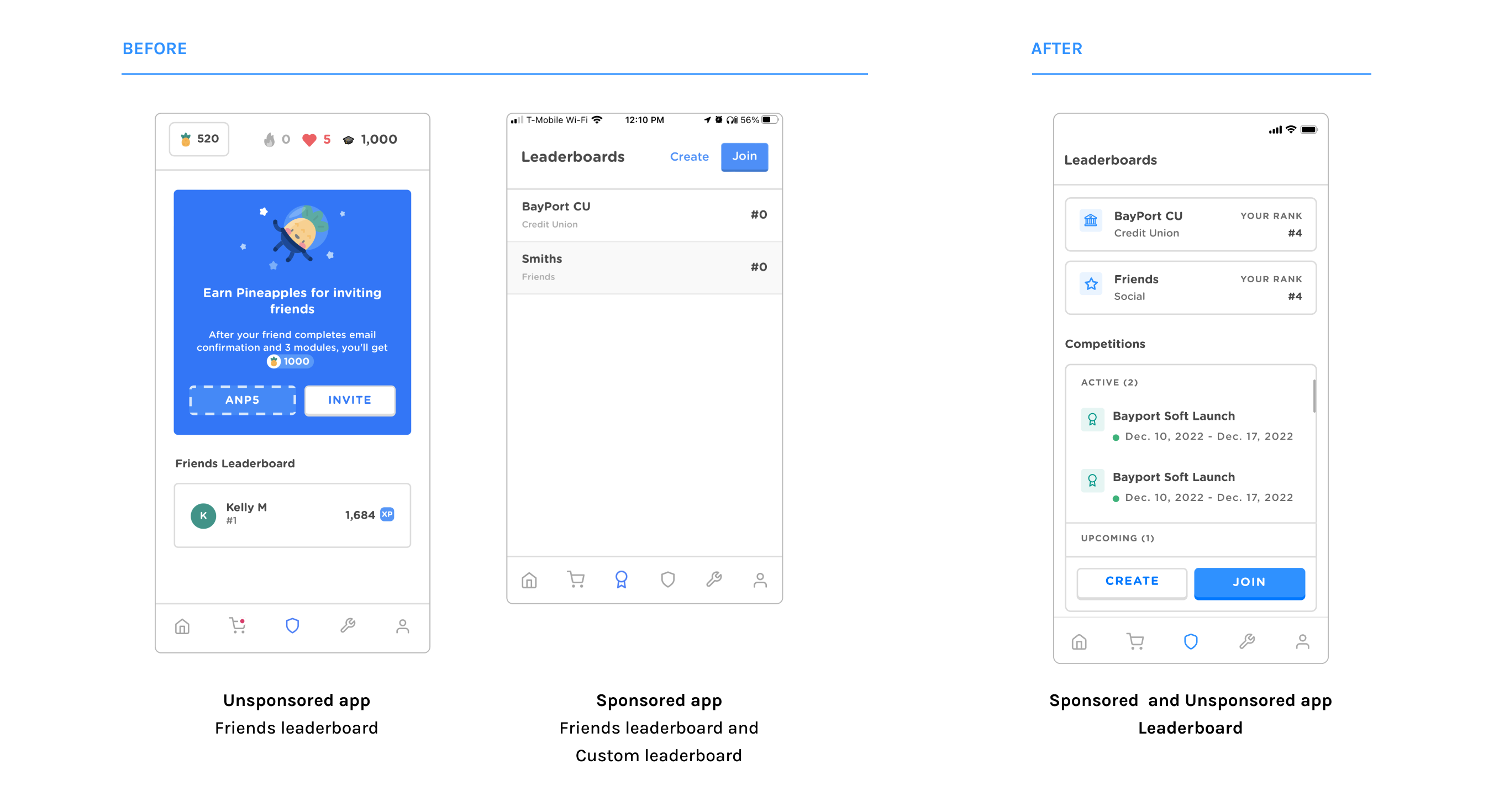
PROTOTYPING
Redesigning profile screen
Zogo's profile used to look like a "Settings" screen with a list of features. The new profile had to include:
- A way to add and see friends.
- Options to edit personal information.
- Displaying earned badges for recognition.
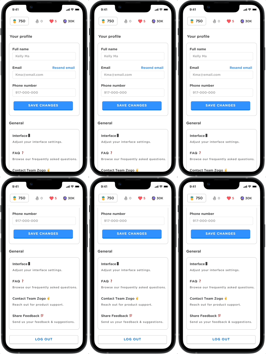
BEFORE
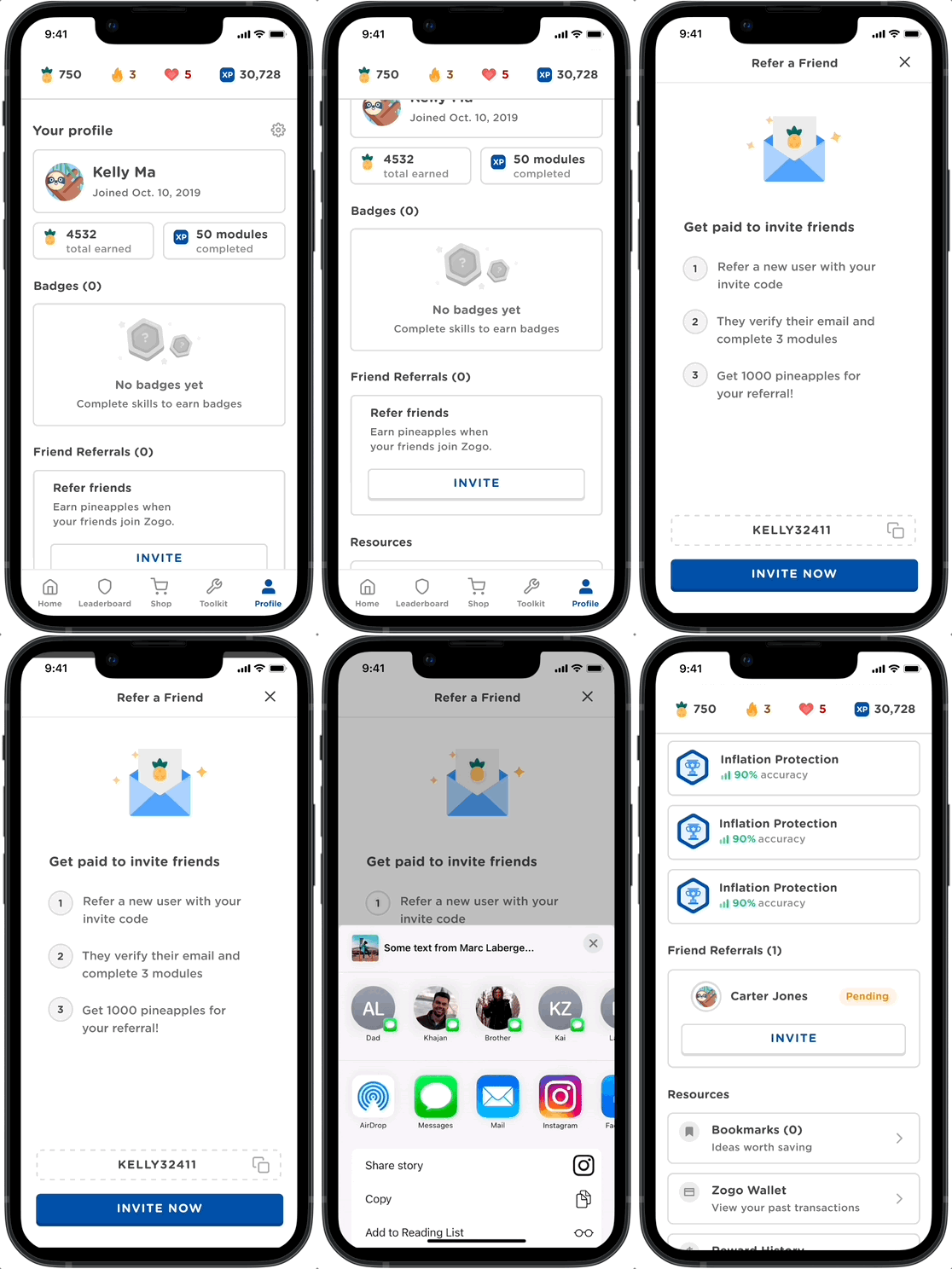
AFTER
INFORMATION ARCHITECTURE
Testing a first iteration
During the initial design phase, Zogo's custom leaderboards were closely resembling a competition feature. They required start and end dates to display participant rankings once the timeframe concluded. We aimed to maintain a general leaderboard, a friends leaderboard, and an institution leaderboard, distinct from the competition feature.
We also introduced arrow indicators to highlight updates made to the leaderboard.
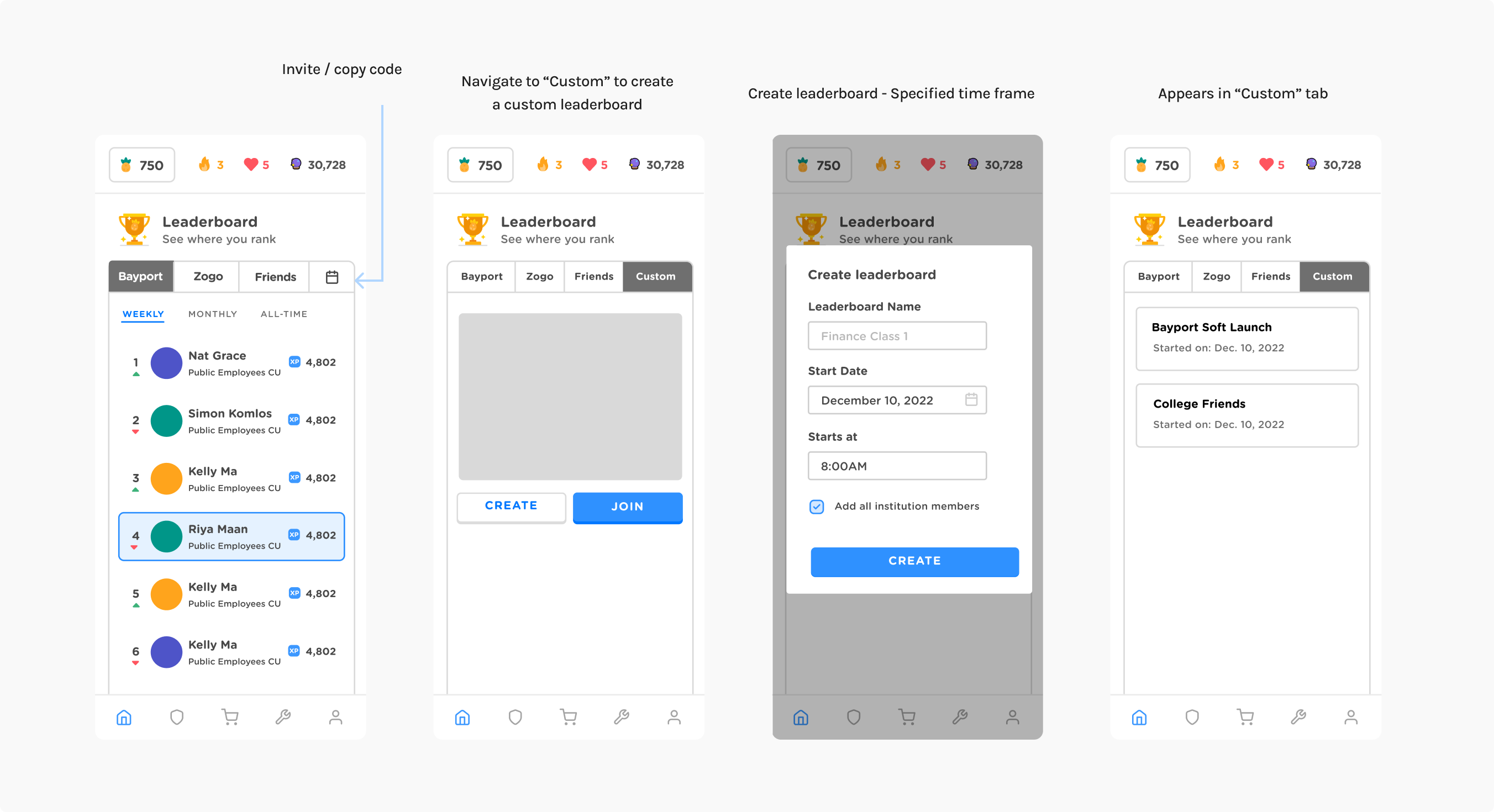
Following usability testing, it became evident that the competition feature was somewhat concealed and not immediately accessible to users. Users encountered challenges in figuring out how to access it. Additionally, while setting a timeframe for competitions appeared intuitive, questions arose regarding the time zone to which these settings would apply.
Final designs
BUSINESS IMPACT
Increase in user engagement
User engagement with leaderboards has surged, reflecting a substantial increase in both the creation and participation of leaderboards
Reduction in time spent in manual work with clients
Time spent by the CX team on tasks with clients had a substantial reduction, signifying a notable improvement in operational efficiency.
User recognition through new profile
The redesigned profile allowed users to better track their progress through skills and friend referrals.
REFLECTION
What I learned
Stakeholder Alignment: I've realized the significance of maintaining clear and consistent communication about project changes to ensure stakeholder alignment. Involving others at various stages of the project helps prevent unexpected surprises and unanticipated risks.
Balancing Diverse User Needs: Throughout this project, I've honed my ability to balance the diverse needs of various user groups. Evaluating how the new design impacts all users from the project's outset has proven instrumental in facilitating a seamless design process.
let's chat!
thanks for scrolling! ‧₊˚✩彡
