DEVELOP FOR GOOD
Connecting volunteers with nonprofits
Redesigning Develop for Good's website to help connect volunteers with nonprofits
Overview
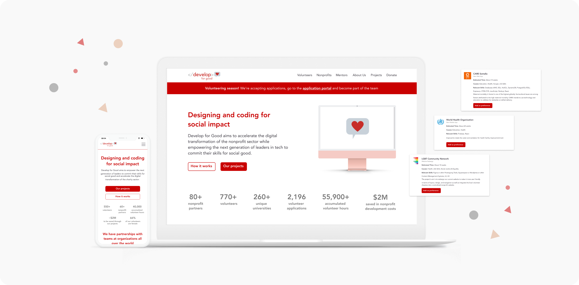
Develop for Good is a nonprofit organization that pairs young professionals with nonprofits to develop digital product solutions. As the organization began gaining more traction, they wanted a complete redesign of their website and application portal to better reflect their brand and story.
Our team was tasked to refine their existing brand and provide a clearer organizational structure for their different audiences.
MY ROLE
UX Designer
THE TEAM
(4) UX Designers
(1) Project Manager
(2) Software Developers
Co-foundera
DURATION
3 months
DESIGN AUDIT
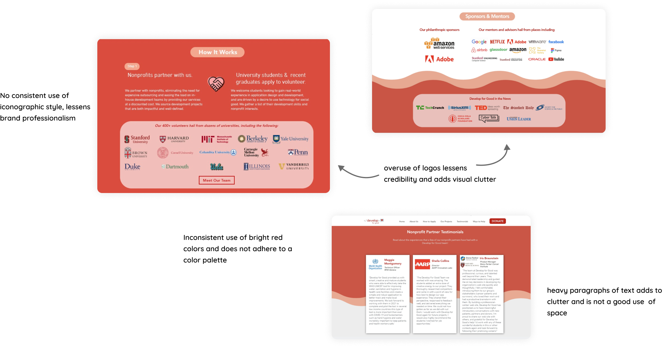
Identifying visual inconsistencies
To begin the design process for DFG's website, I conducted a comprehensive analysis of the existing website to gain a holistic understanding of its current state. I then collaborated with the client to determine their vision and goals for the redesign. Using this information as well as research on competitor websites, I created a refined version of the website that incorporated consistent type styles and color schemes. This helped ensure that the website maintained a cohesive visual identity throughout.
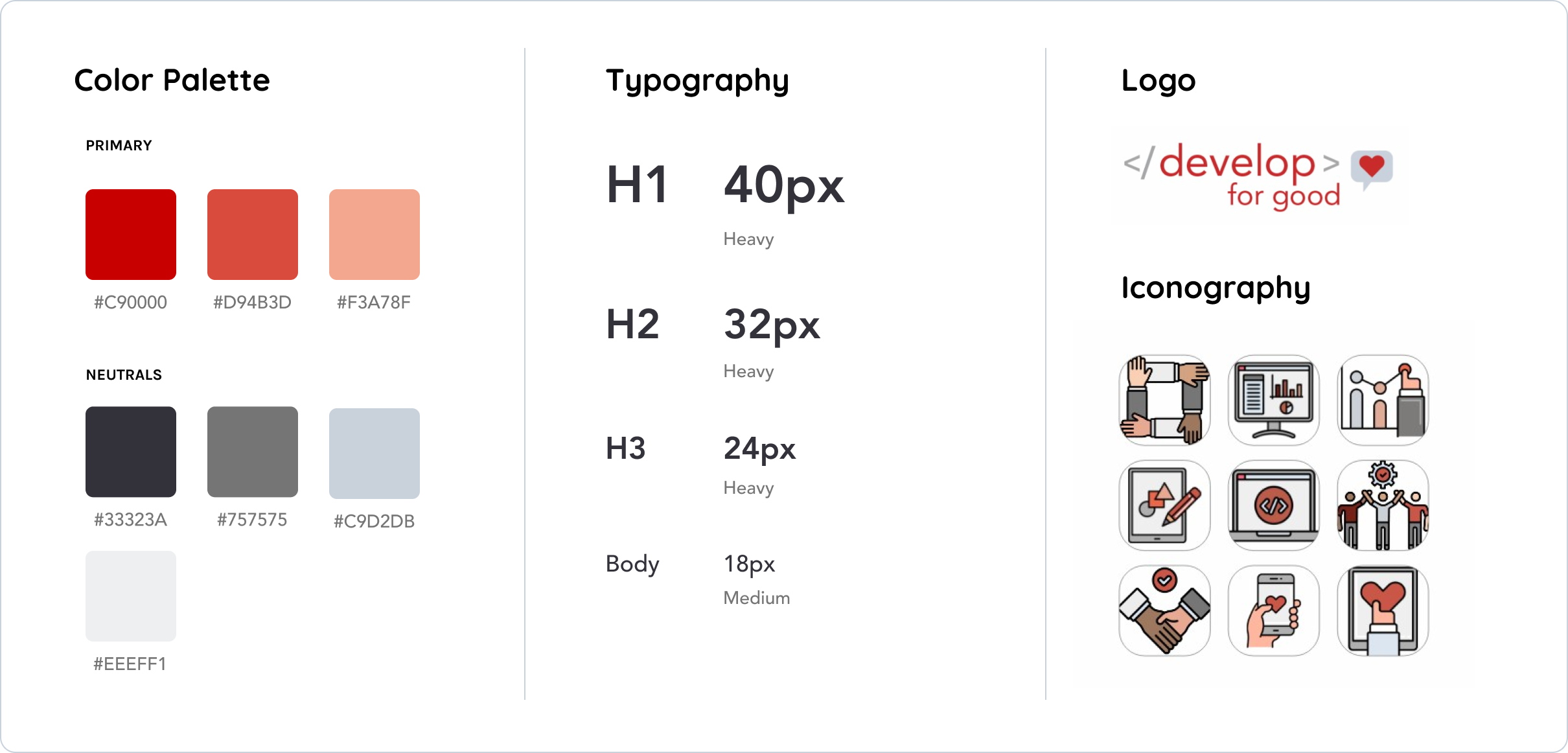
STYLE GUIDE
Enhancing DFG's brand
Adhering to their initial vision, we carefully selected colors and typography to reflect a sleek and approachable aesthetic. These enhancements aimed to create a cohesive and memorable user experience, fostering trust and professionalism.
USER INTERVIEWS
Who are our users?
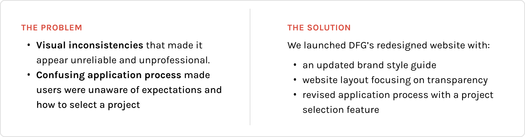
During the early stages of the project, one of the primary challenges was identifying the main user groups for the DFG website. With the organization serving volunteers, nonprofits, and mentors, it was essential to gain a clear understanding of the needs and expectations of each group.
To address this challenge, I conducted interviews with members of each user group. The feedback I received highlighted a common issue: a lack of transparency. Users expressed concerns about unclear expectations, confusion about the process, and an overwhelming amount of clutter on the website. These insights informed our design decisions and helped us create a more streamlined and user-friendly experience for all user groups.
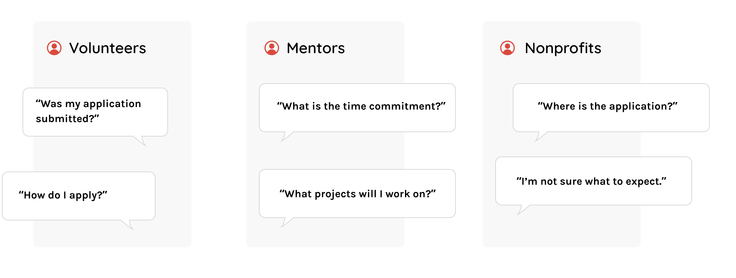
While many users appreciated the information presented on DFG's website, they often found it overwhelming and disorganized. However, the most common frustration expressed by users was related to the application process rather than the main website.
During our user interviews, many users described confusion and uncertainty regarding the application process. Specifically, they were unsure what to expect and found selecting projects to be confusing. Users also expressed a desire for more information regarding expectations, commitments, timelines, and the overall process.
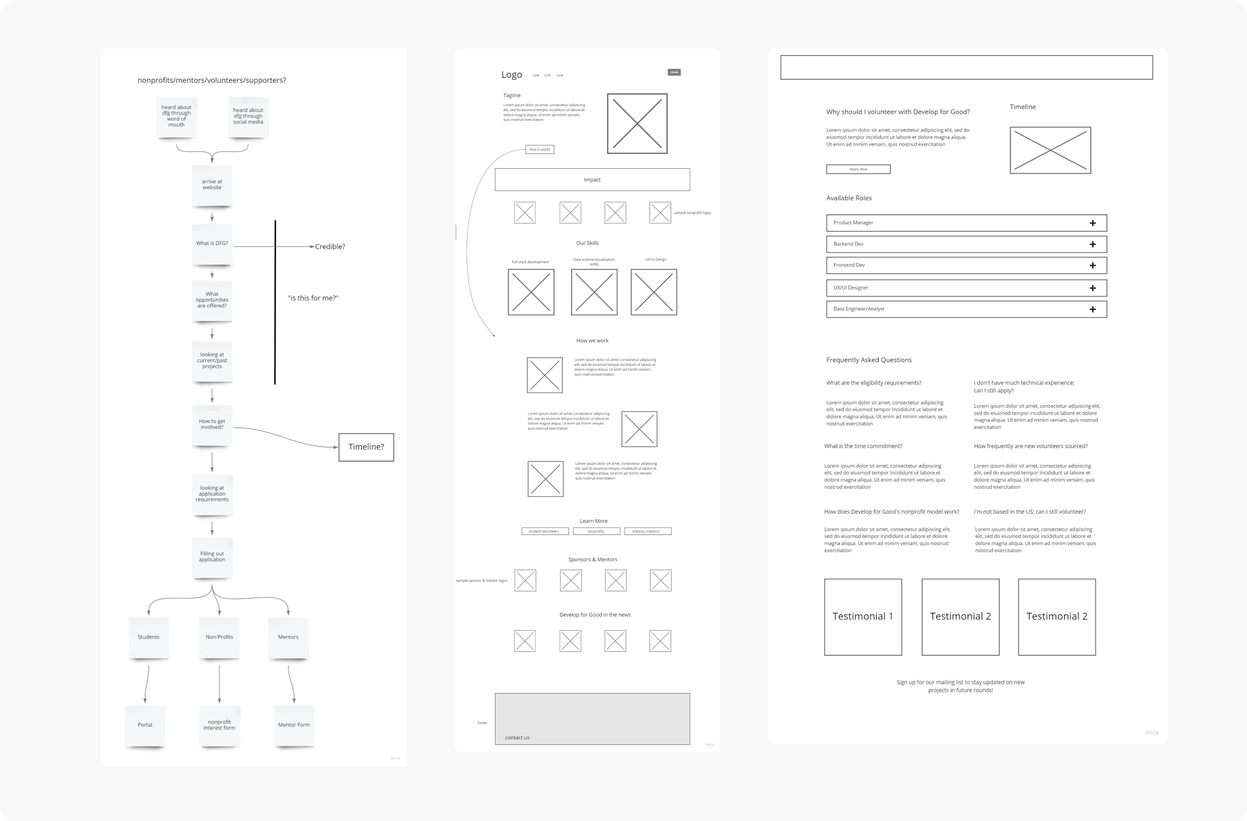
LOW-FI WIREFRAMES
Brainstorming different layouts
We considered different layouts to presenting information while highlighting:
- case studies of past projects
- a clear step by step process for working with DFG
- organizations and partnerships for credibility
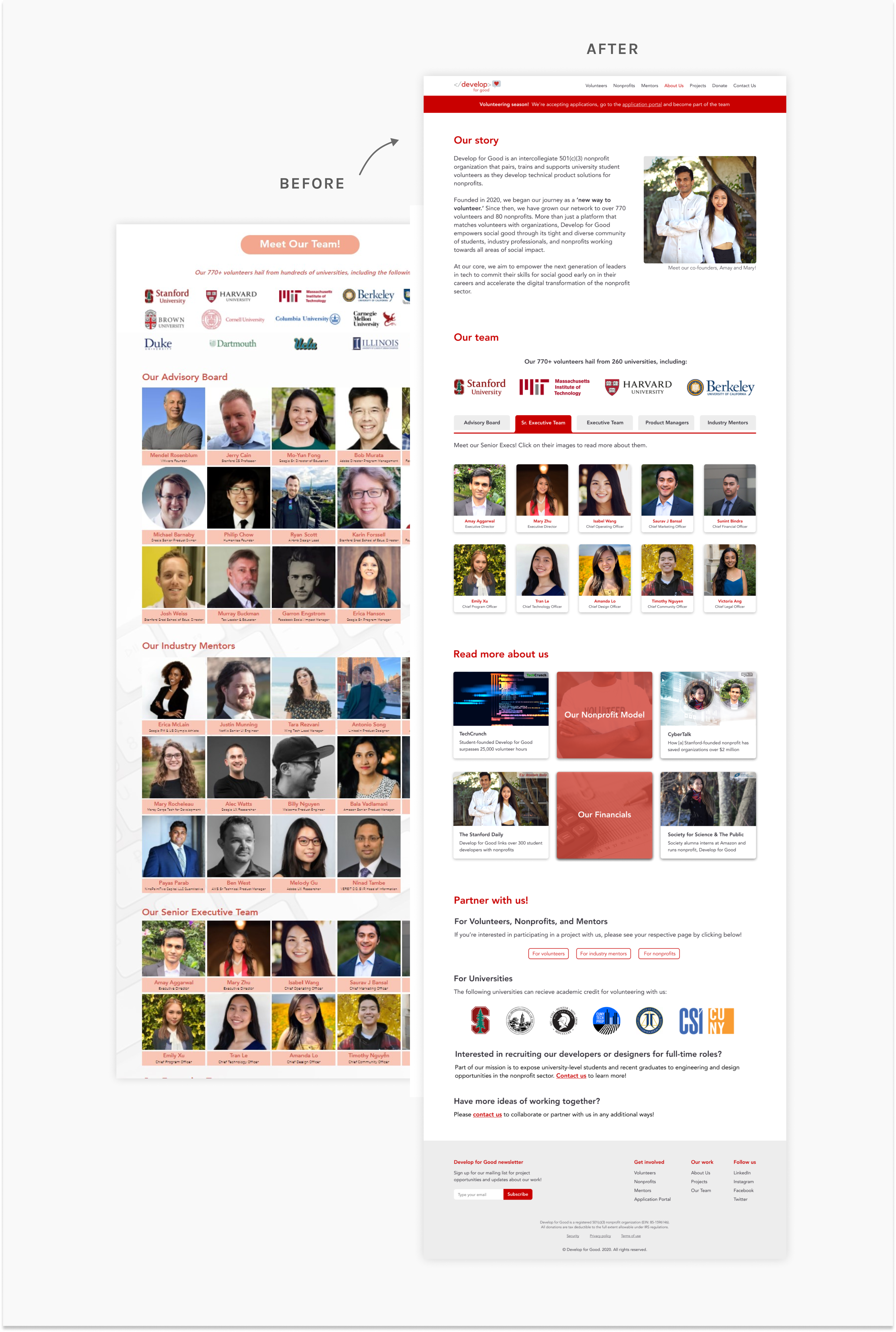
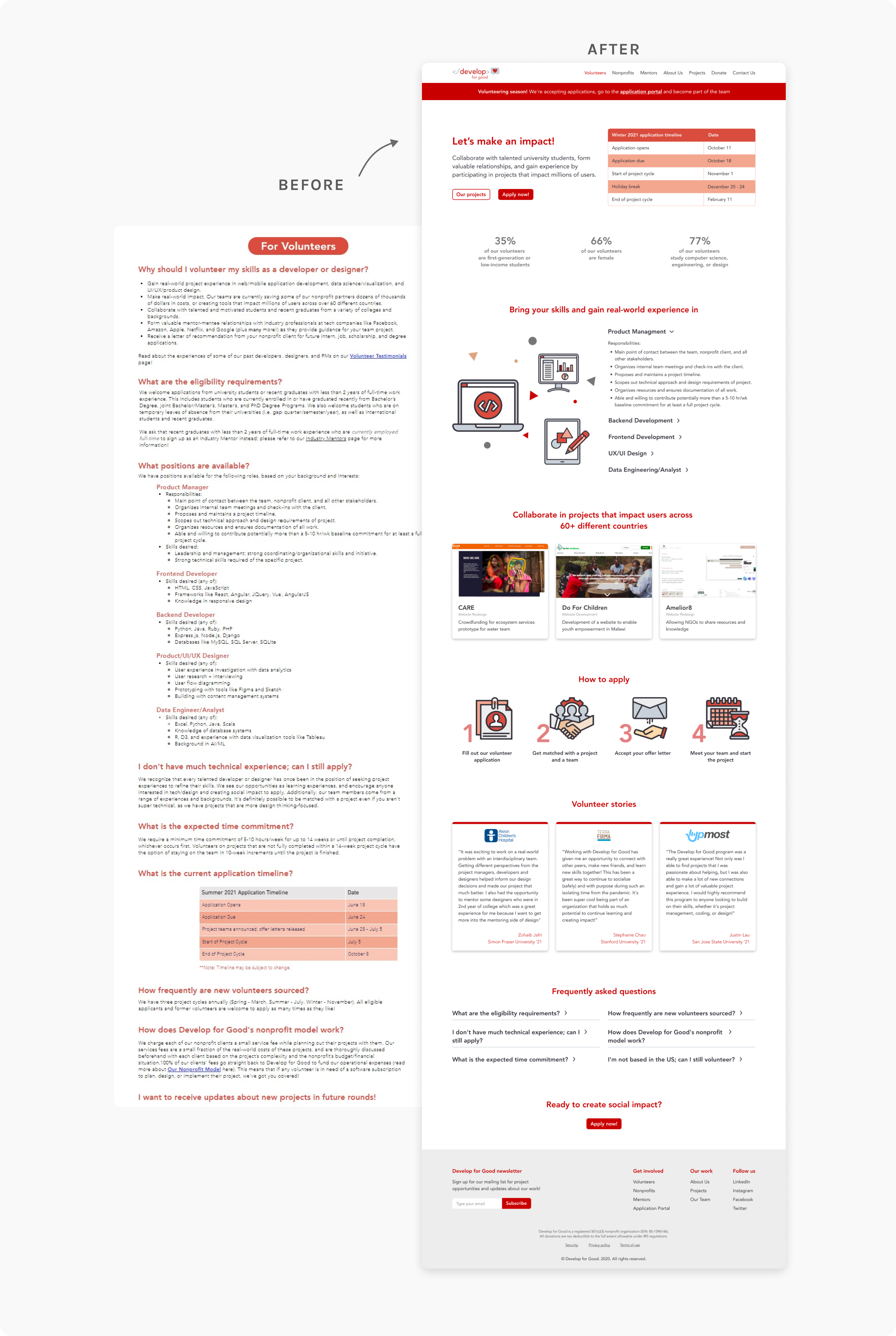
THE FINAL WEBSITE
How can we make the application process clearer?
Based on our findings, we identified the key issues that were causing frustrations which included a long and complex application form, redundant and irrelevant questions, and a lack of mobile-friendliness.
We then developed a new design for the application process, which focused on simplifying the application form and providing clear and concise instructions throughout the process.
To simplify the application form, we removed redundant and irrelevant questions, and re-ordered the questions to create a logical flow.
LOW-FI WIREFRAMES
Brainstorming different layouts
We considered different layouts to presenting information while highlighting:
- case studies of past projects
- a clear step by step process for working with DFG
- organizations and partnerships for credibility
Breaking up the application process
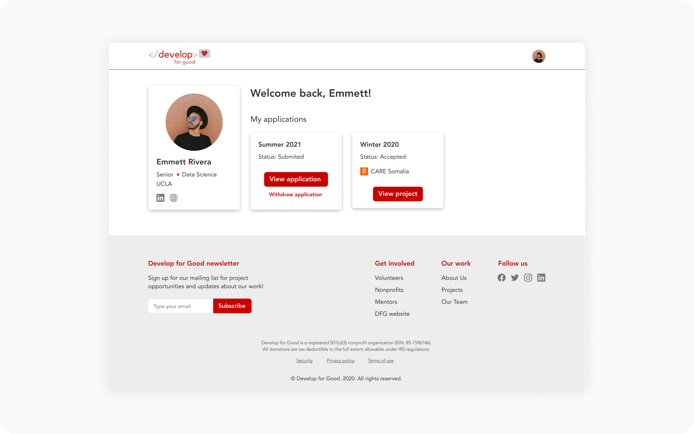
In conjunction with the application process, a project selection step was needed for volunteers to select projects of their preference. Considering this multi-step process, we added a wizard to provide a clear indication of where the user is in the process.
Prioritizing project selection
To make the project selection more prominent, we added a fixed bar to the design to allow users to keep track of their selections.
Application tracking portal
To provide clear and concise instructions throughout the process, we used plain language and provided contextual help wherever necessary. This helped students understand the questions and respond appropriately.
LEARNINGS
Reflection
Ensuring alignment with the client throughout the project is crucial for a successful outcome. Maintaining open lines of communication and handling any changes or updates promptly can help prevent unnecessary back-and-forth. To achieve this, asking effective questions upfront is essential. Here are some examples:
1. What are the primary goals and objectives you want to achieve through this project?
2. Who is your target audience, and what are their specific needs and preferences?
3. Are there any existing design or branding guidelines that should be considered?
By seeking clarity early on, the number of iterations and delays can be reduced, resulting in a streamlined process.
However, despite thorough planning, unexpected constraints may arise. Flexibility is key in such situations. Being able to quickly devise solutions and identify appropriate next steps is essential to meet deadlines and deliver a successful project.
It's important to remember that the design process is iterative, but there comes a point when "done" is good enough. Balancing perfection with practicality is crucial in delivering a high-quality product within the agreed-upon timeframe.
let's chat!
thanks for scrolling! ‧₊˚✩彡