Wonder House Supply Inc.
Improving efficiency for a local hardware store.
PROJECT OVERVIEW
Wonder House Supply Inc. is a local hardware store located in Brooklyn, NY. Currently, they have a limited digital presence and would hope to gain more in-store traction.
ROLE
UX Designer
DURATION
5 Weeks
TOOLS
Figma
PROBLEM
Hardware store visitors want a quick and informed process for product purchases.
Wonder House Supply would need a solution that is easy to use and maintain.
GOALS
Create a simple process for browsing and locating products.
Build a visual brand that aligns with business values.
MY APPROACH
Adding a pick-up feature to drive consumers in store.
Easy to browse categories and filters so that users can locate products quickly.
EMPATHIZE
Client Interview
I began with an interview with the client to understand what they were hoping to achieve with the website and if there are any limitations.
About Wonder House Supply:
- They want to be able to provide a more efficienct process for customers and reduce waiting times.
- Increase customer base and sales.
- Their store carries a variety of products including plumbing supplies, hardware tools, and home improvement related products. Additionally, they provide construction and repair services.
- For their site, they would like to promote popular products, business information, and ways to contact.
EMPATHIZE
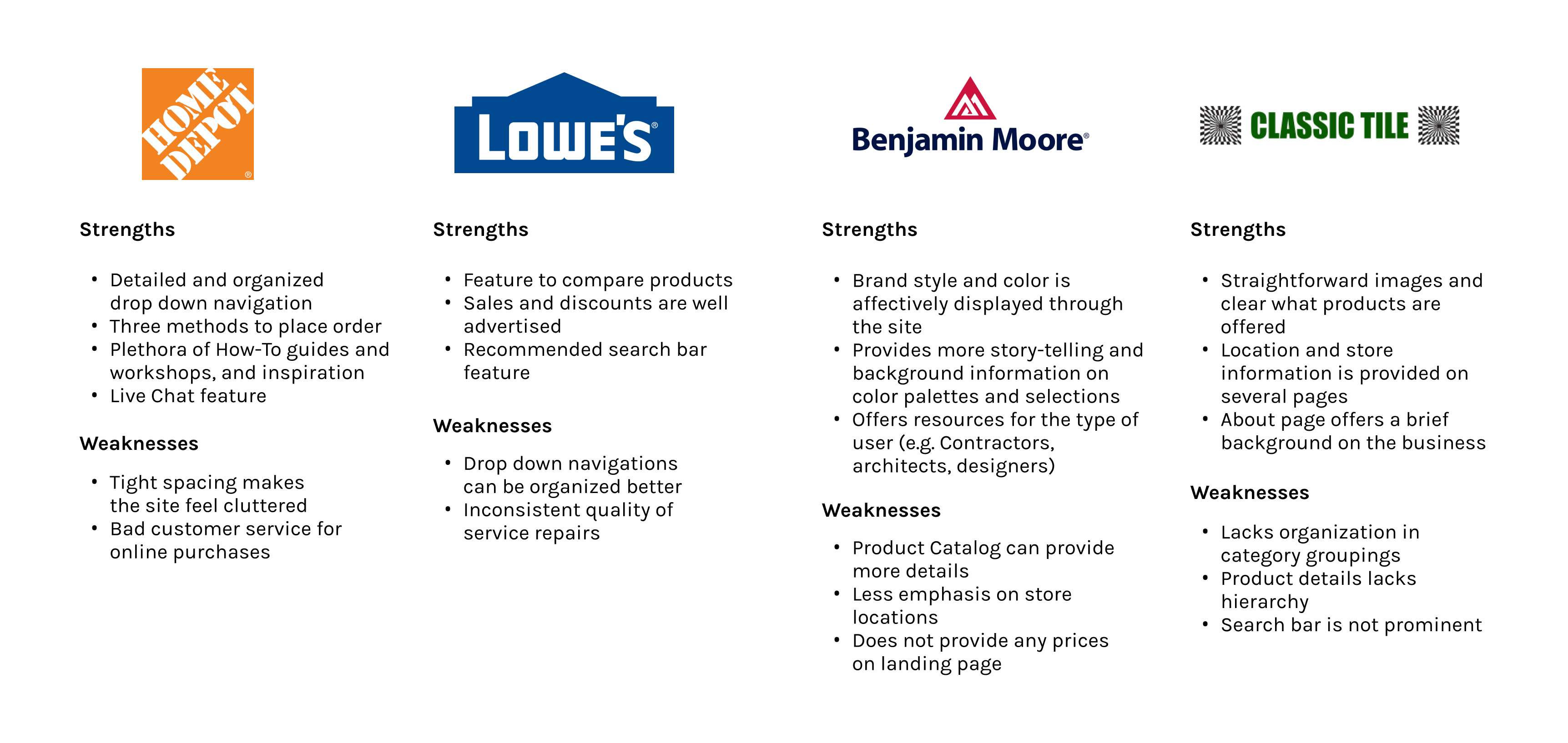
Competitive Analysis
Top and local hardware store sites were evaluated to familiarize myself with industry standards and effective/noneffective solutions. While larger hardware stores may not be direct competitors, it is important to consider common categorization methods and features for ideation.
EMPATHIZE
Interviews with Potential Customers
I recruited 5 hardware store visitors to learn about their motivations and experiences with in-store and online visits. 3 were conducted via Zoom and 2 conducted in-person.
Research Goals:
- What information would be helpful for existing customers?
- What are hardware store visitors' process through purchasing products?
- What are some frustrations users might have when navigating through sites with a large inventory?
EMPATHIZE
Uncovering Key Patterns
With my interviews transcribed, I organized each participants’ comments and interactions into common groupings.
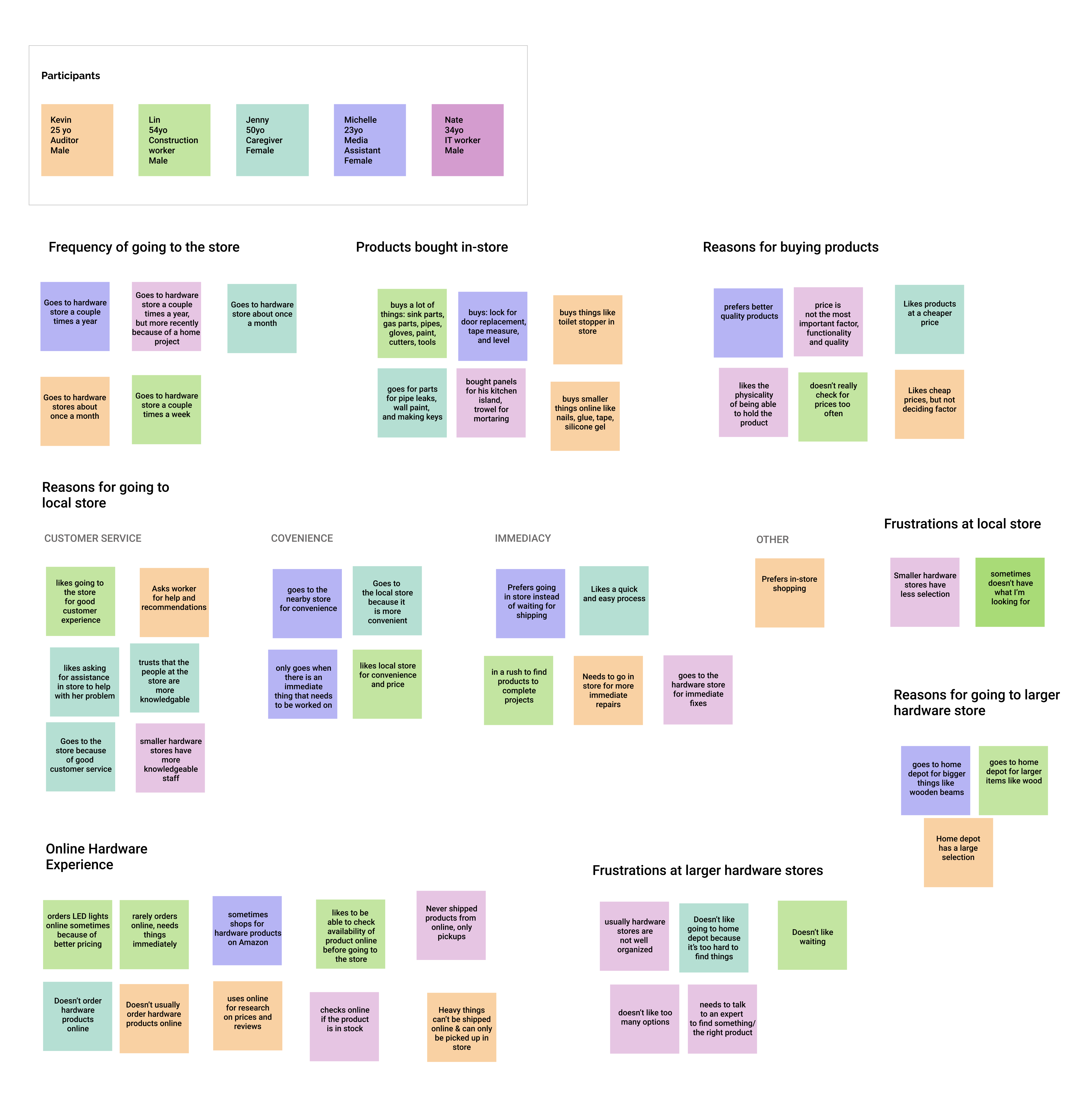
5/5 prefer going to local hardware stores
All participants mentioned that they usually visit hardware stores when their is an immediate need for a certain product. They go for repairs that need to be fixed as soon as possible.
4/5 visit hardware stores to get assistance
Participants want to be able to ask an experienced worker for suggestions on how to use certain products or if they are buying the correct one.
3/5 do not like waiting at larger hardware stores
Participants wanted a quick and easy checkout process and did not like having to spend a lot of time waiting in lines.
EMPATHIZE
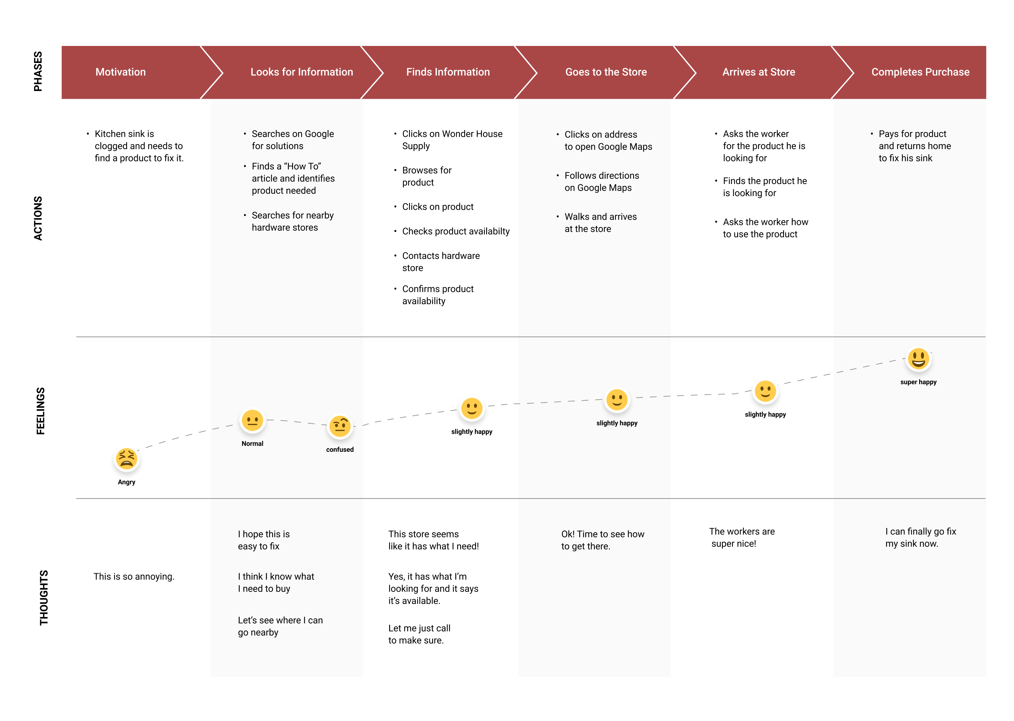
Customer Journey Mapping
To further convey a better understanding of a potential customers thought processes, I imagined a possible scenario based on interview findings. This journey is based on findings from my interview and the customers interactions given an ideal product.
IDEATE
Brainstorming Site Features
To begin generating some viable solutions for the site, I followed the Crazy 8's method of sketching. I sketched all the possibilities of organizing products and categories with my persona in mind and selected features that seemed most fitting.
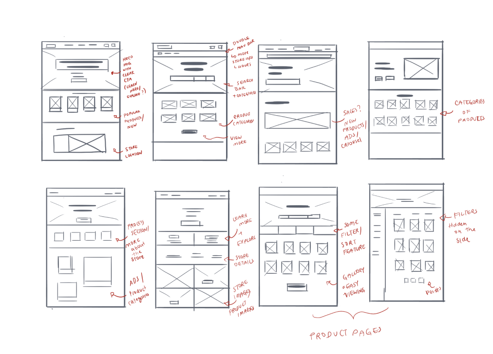
IDEATE
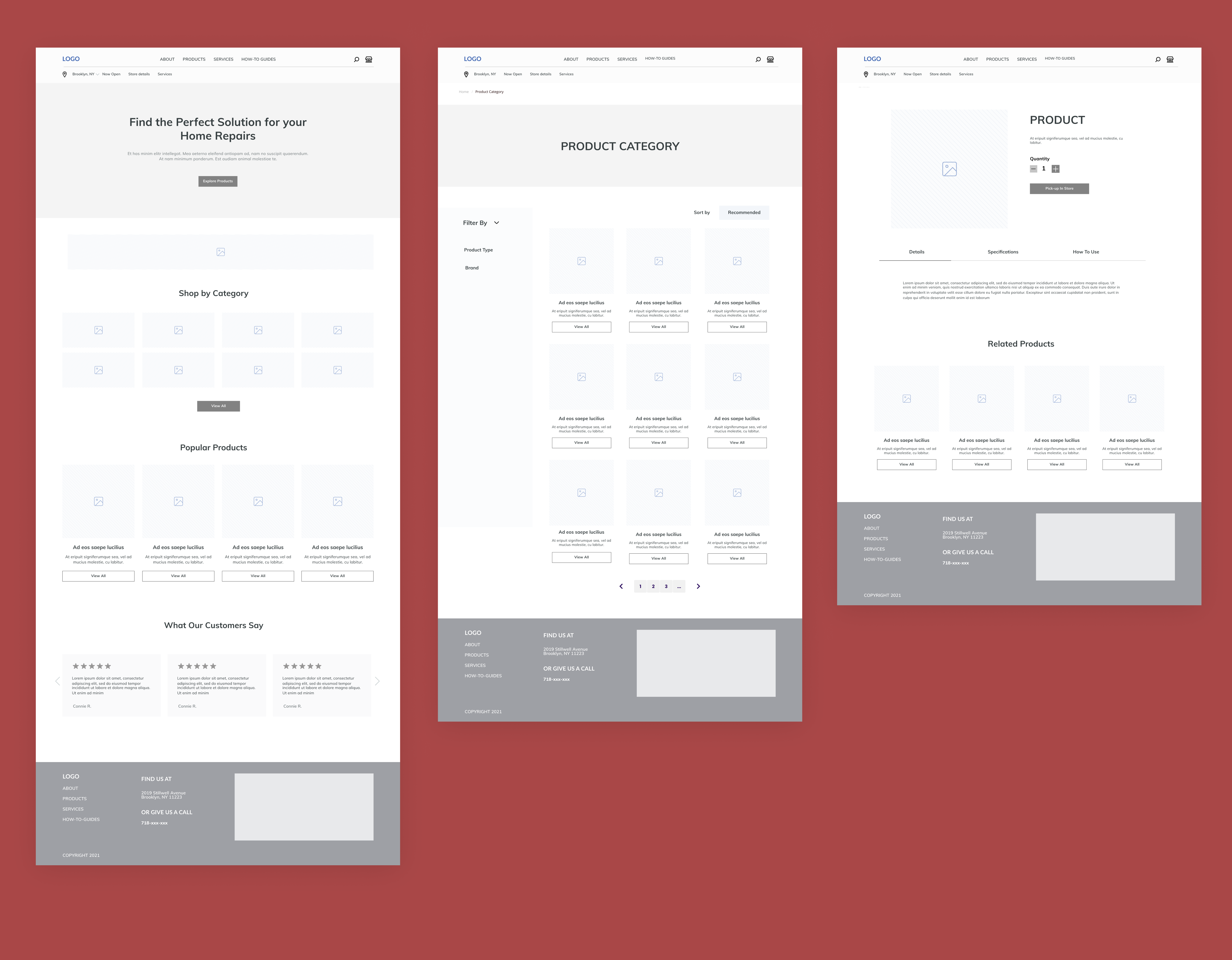
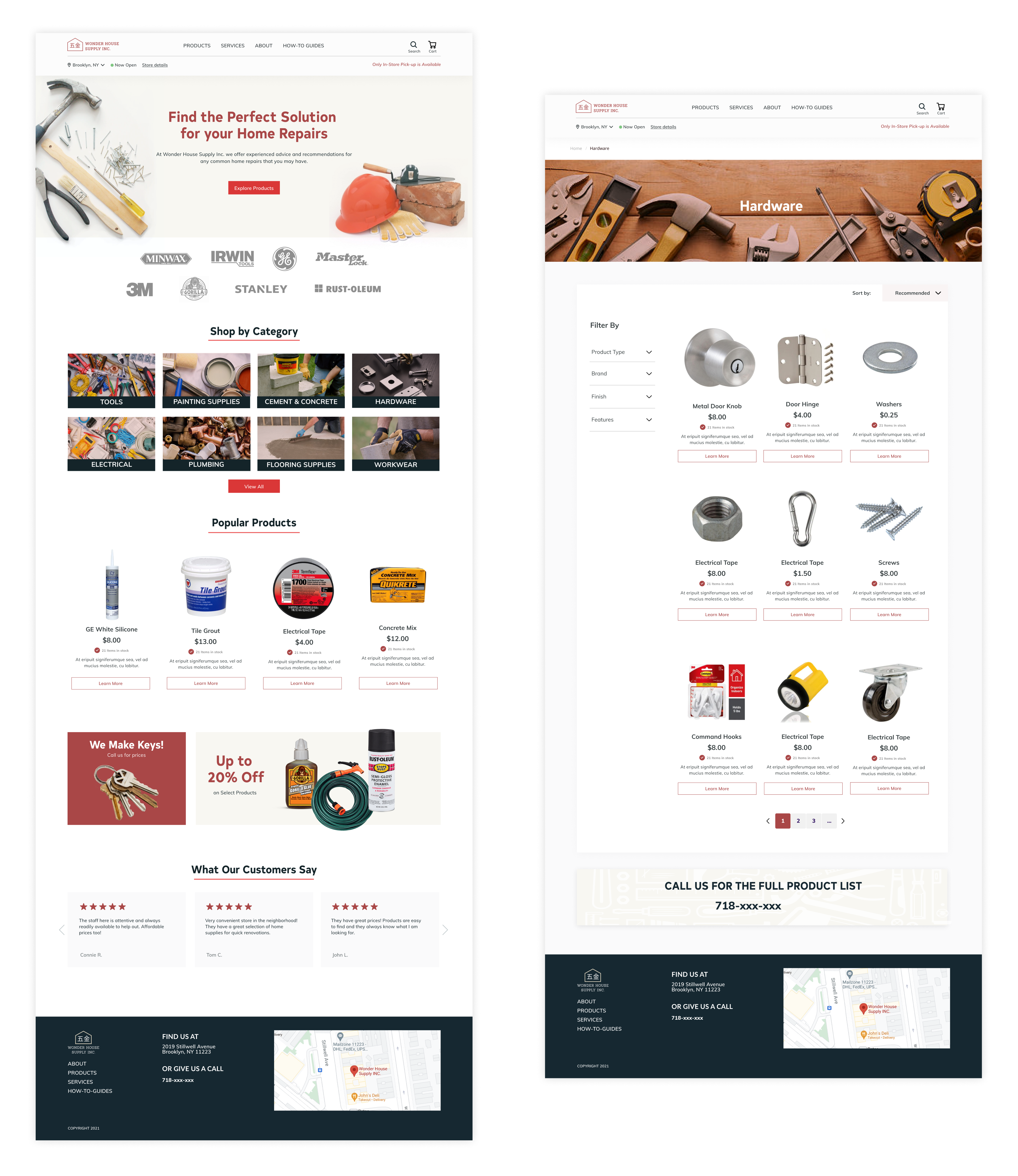
Mid-Fi WireFrames
Pulling bits and pieces from my sketches, I created mid-fi wireframes to show the user's process through requesting a pick-up and locating services. I applied a consistent grid throughout the layout to organize the wide assortment of products.
IDEATE
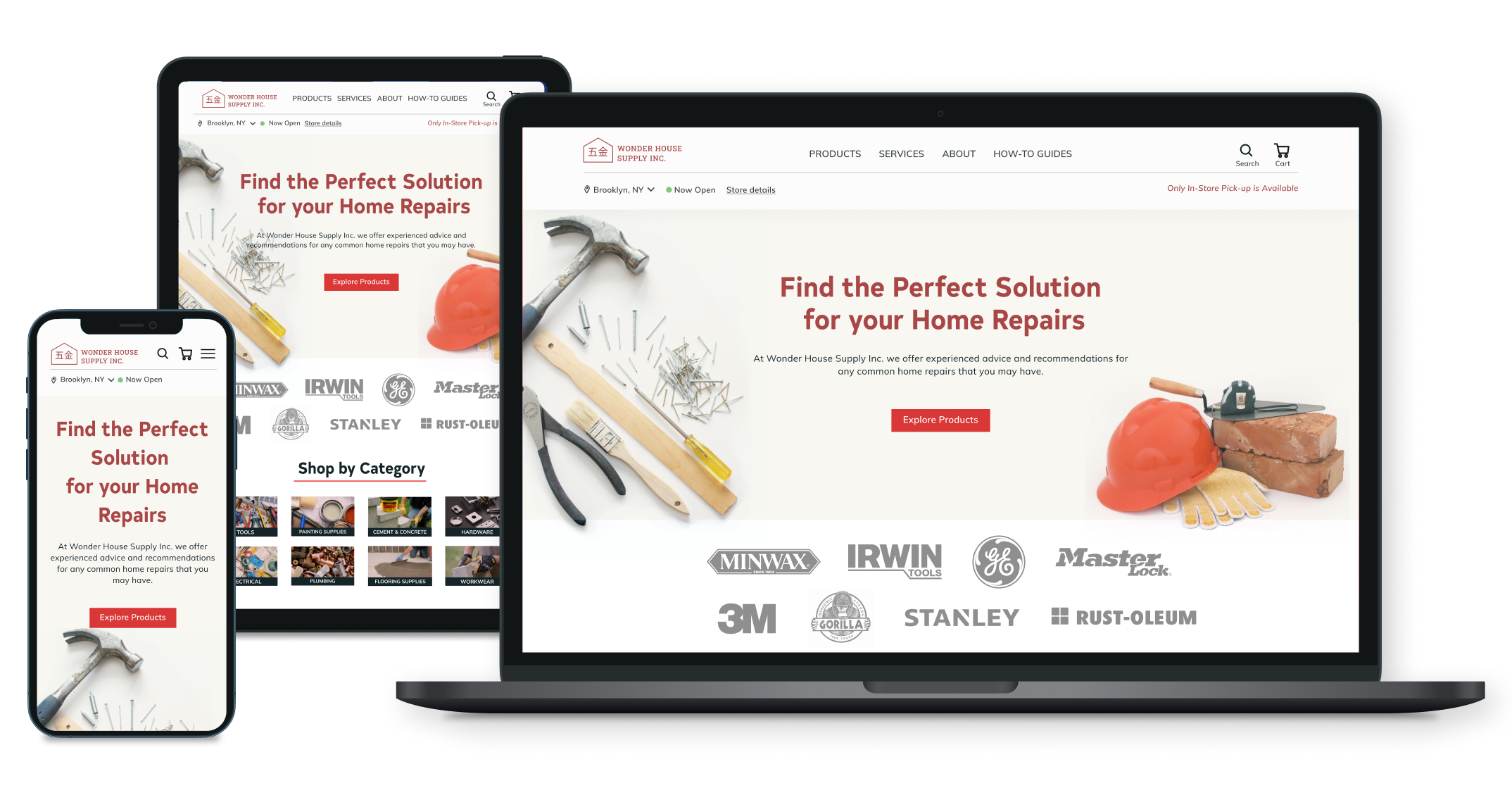
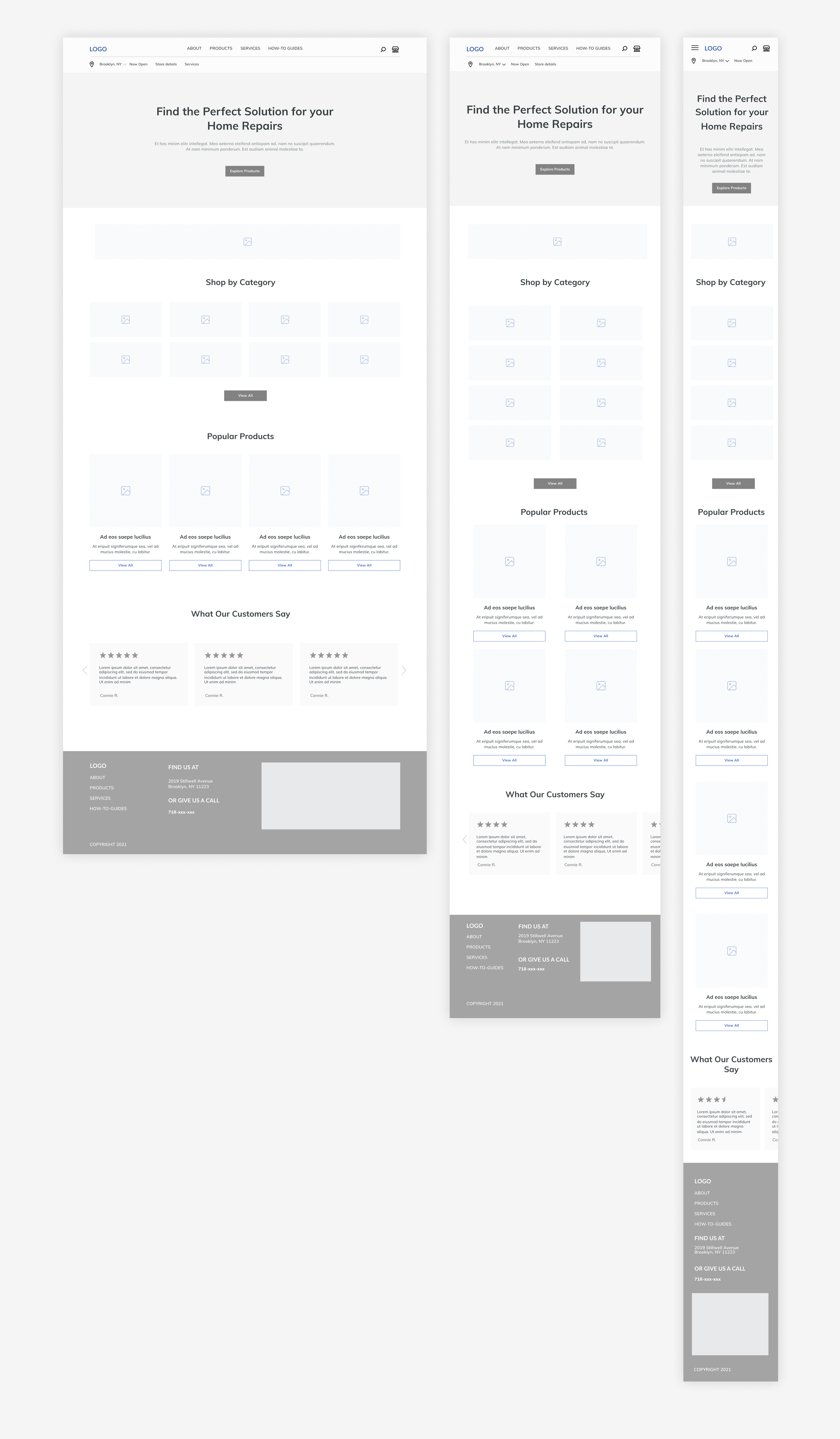
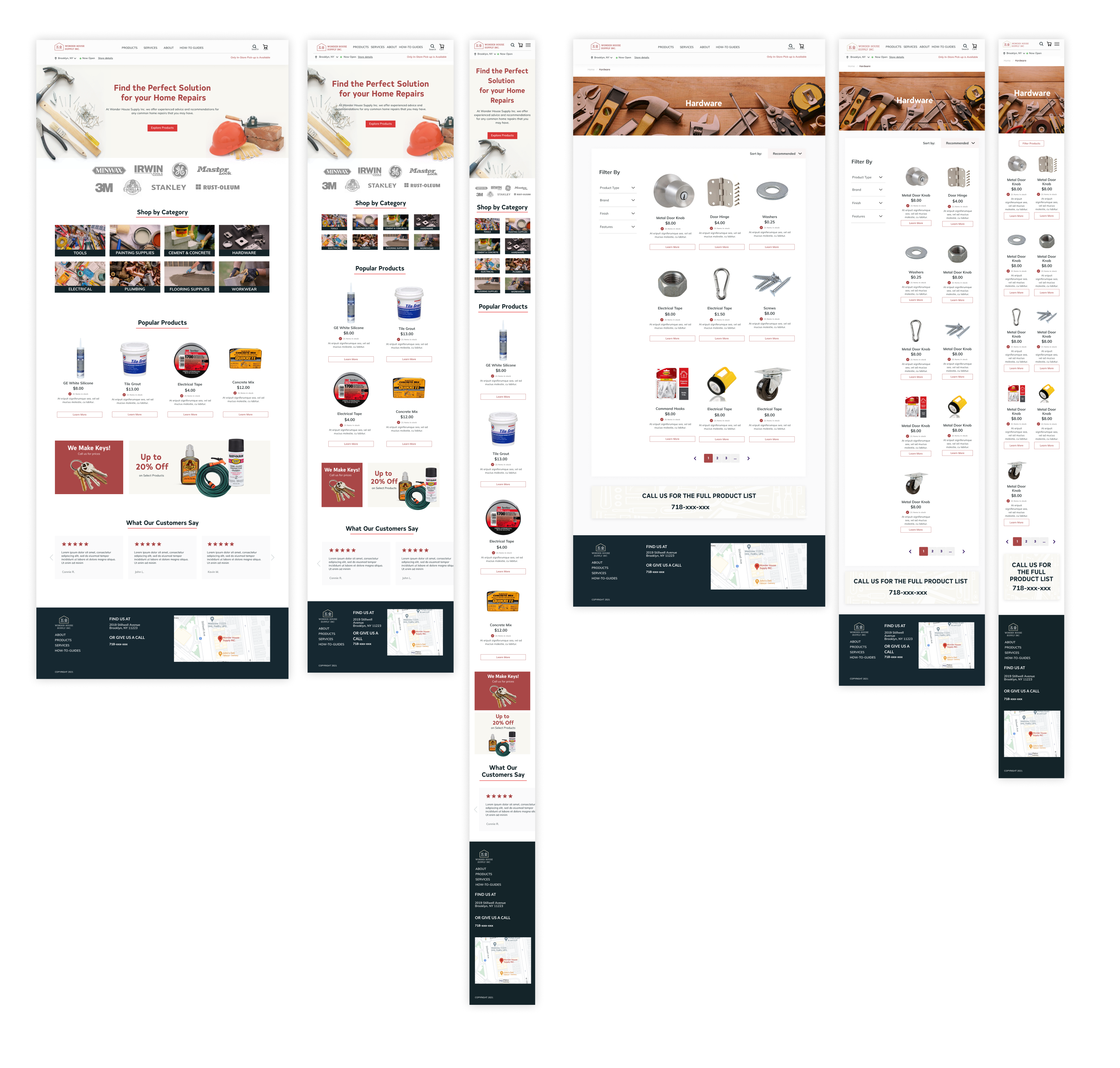
Designing Responsive Frames
Referencing competitor sites, I built out responsive frames in an effort to maintain consistency with sizing and scaling. Since hardware store visitors are usually in a rush for time, the mobile version of the site should be optimized.
VISUAL DESIGN
Creating a Logo
Wonder House Supply has an exisitng type logo, but not a lot of brand design applications. In order to refine their exisiting brand, the logo was redesigned with their brand values in mind: reliable, professional, and friendly.
VISUAL DESIGN
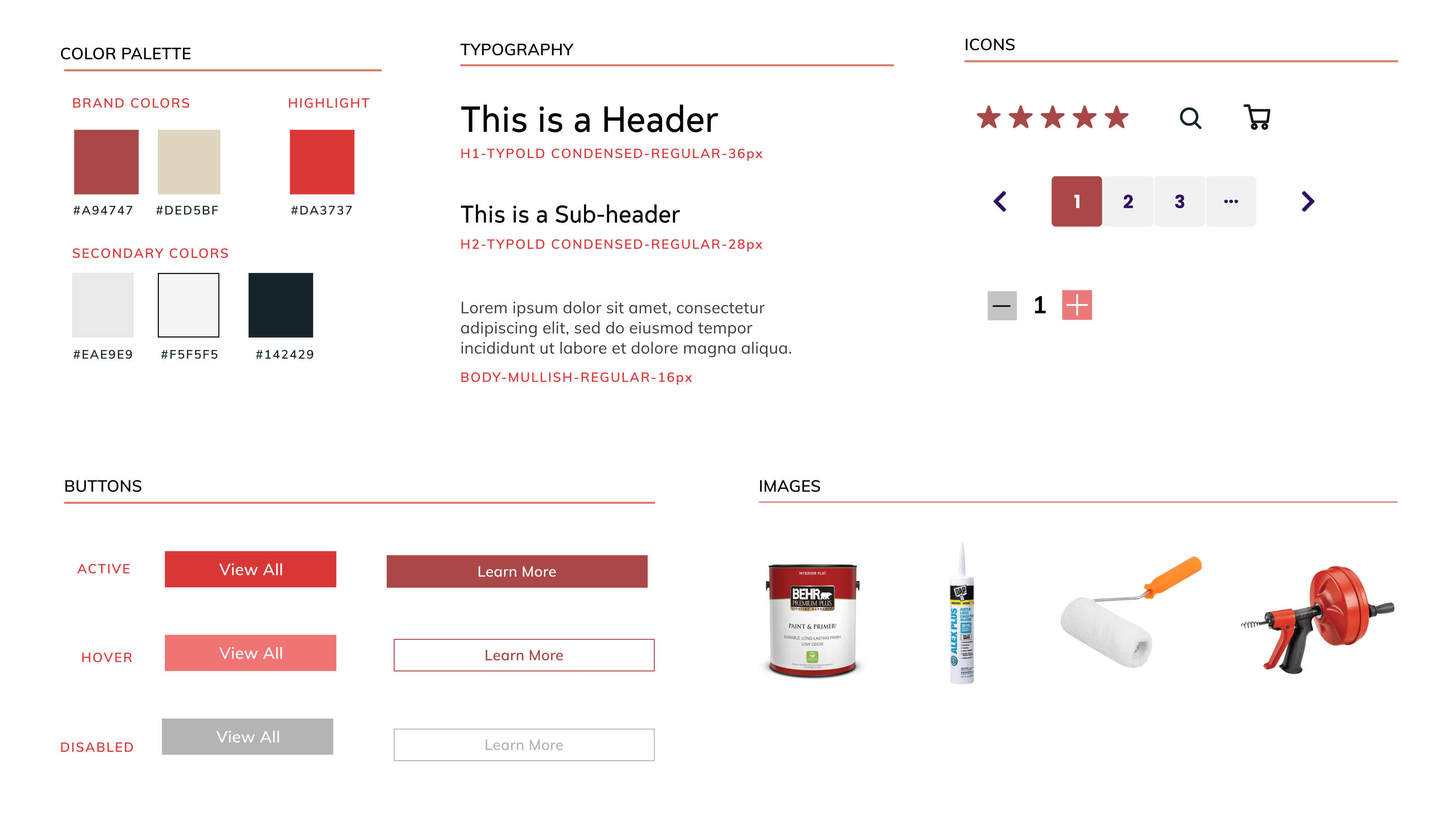
Developing a Style Guide
Wonder House Supply currently has a red color that is used throughout their store and would like to keep this color for their brand. More neutral colors were added to complete the palette. Type, images, and Icons were chosen to create a site that visually appears uncluttered and straightforward.
VISUAL DESIGN
Adding Color to My Wireframes
While adding visual elements to my wireframes, I found card organization to be quite challenging. There is so much information that would be helpful to include, but ultimately, not enough space to include everything. I decided that having an indicator of product quantity would be useful for users to be aware of the store's inventory and plan accordingly.
TEST
Usability Testing
While creating my frames and prototyping, I decided to focus on two main tasks to be tested.
Scenario 1:
You’re at home and as you are closing your door, you realize that your doorknob is broken. You’ve had experience replacing a doorknob before and would like to find a replacement doorknob as quickly as possible.
Task: Find the doorknob and request a pick-up.
Scenario 2:
You have new tenants moving into your house and would like to make a few more copies of your keys.
Task: Find where you can get more detailed information about copying keys.
TEST
Affinity Mapping
I grouped together similar comments from participants and decided which negative experiences would be high-priority fixes. I made these decisions based on the levels of effort required from a technical perspective and the impact it would provide users.
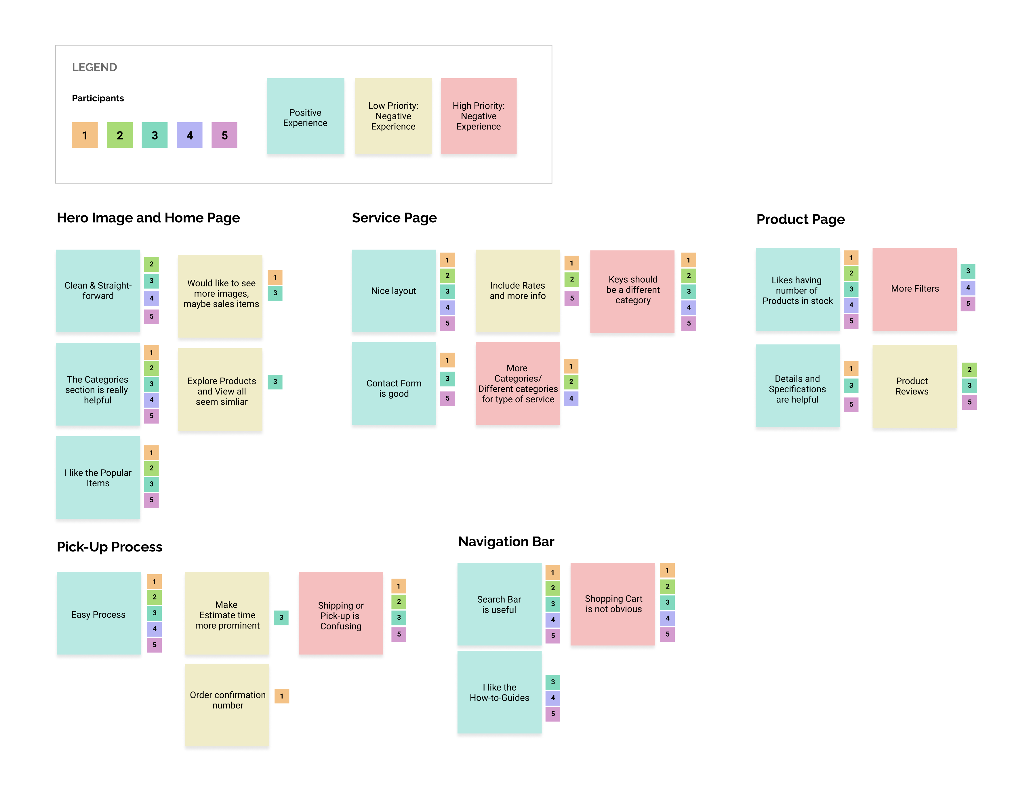
Patterns
4/5 were confused about the “Store” icon.
5/5 thought keys should be a different category.
3/5 wanted more filters for products.
3/5 wanted more information on services.
Insights
The “Store” Icon is not recognizable as cart.
Users expect “Keys” to belong in a different category as an
in-store service.
Users expected to be able to filter the type of door knobs
they would like to see.
Users would like to see more details/rates of services.
Recommendations
Change the “Store” icon to a “Cart.”
Put Keys in a different category/ on the home page.
Add more filtering options.
Add more details on the “Services” page.
ITERATE
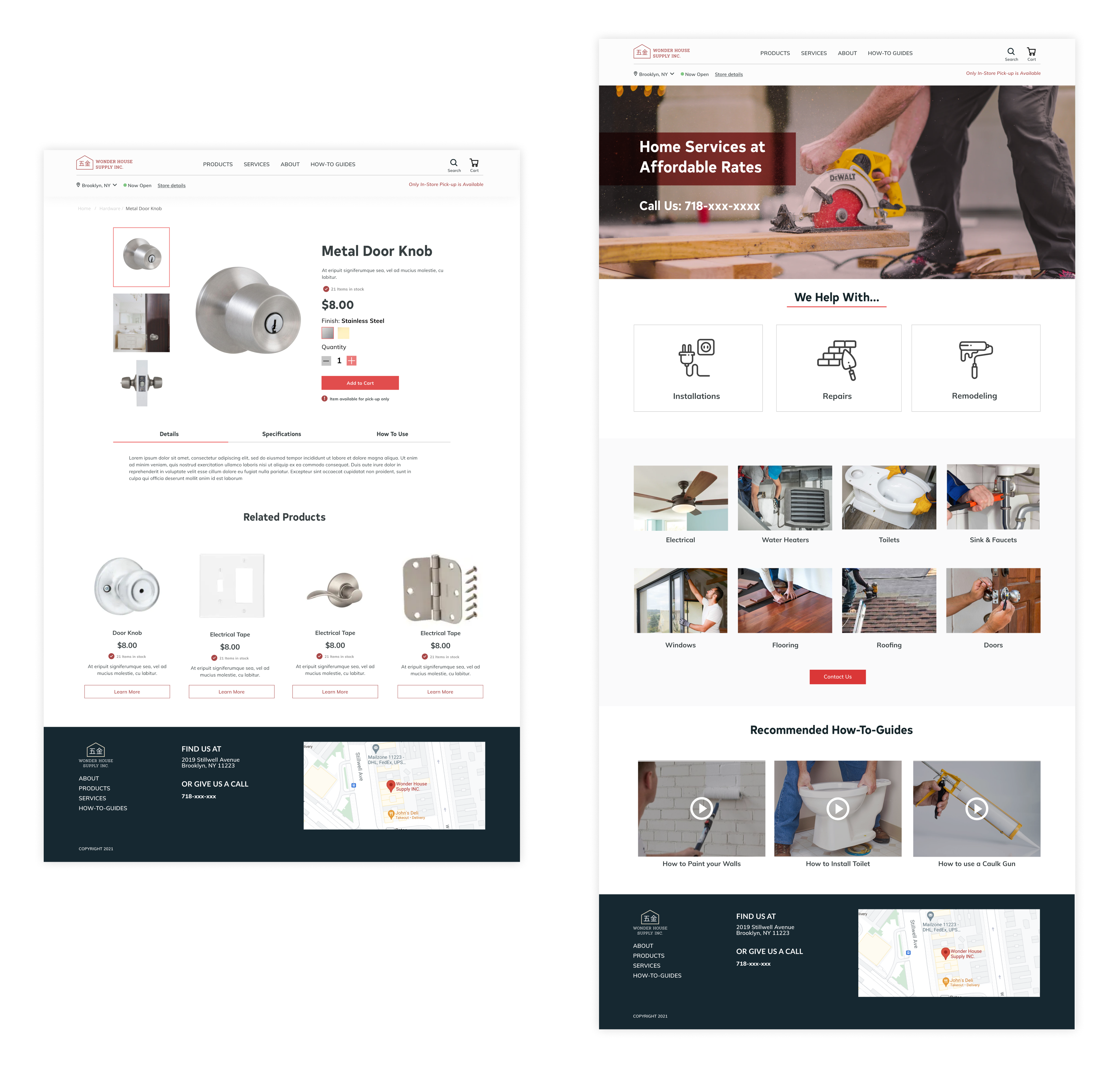
Final Hi-Fi Wire Frames
Applying the feedback gained from usability tests, I made final changes to my wireframes and prototype. Key making services are now on the front page included with in-store deals. Services page now included more information on the services provided.
LEARNINGS
Reflection
Aligning business & user goals
Given that Wonder House Supply is a local hardware store, it became a challenge of identifying what separated a local business vs. a larger business. There could be numerous solutions to improving time efficiency for customers and workers, but they had to be limited to what is technically feasible for a local business. It is important to identify these constraints early on in the process and work collaboratively with the client to ensure that product can actually come to fruition.
Next Steps
If I had more time I would:
- Conduct another round of user testing to see if my iterations have solved the initial issues.
- Refine the services and about pages to provide more detailed information.
- Consider what the process would be like after a pick-up is requested and if there would additional areas of confusion.
let's chat ฅ՞•ﻌ•՞ฅ
thanks for scrolling! ‧₊˚✩彡