ZOGO
Enhancing Zogo's mobile learning experience
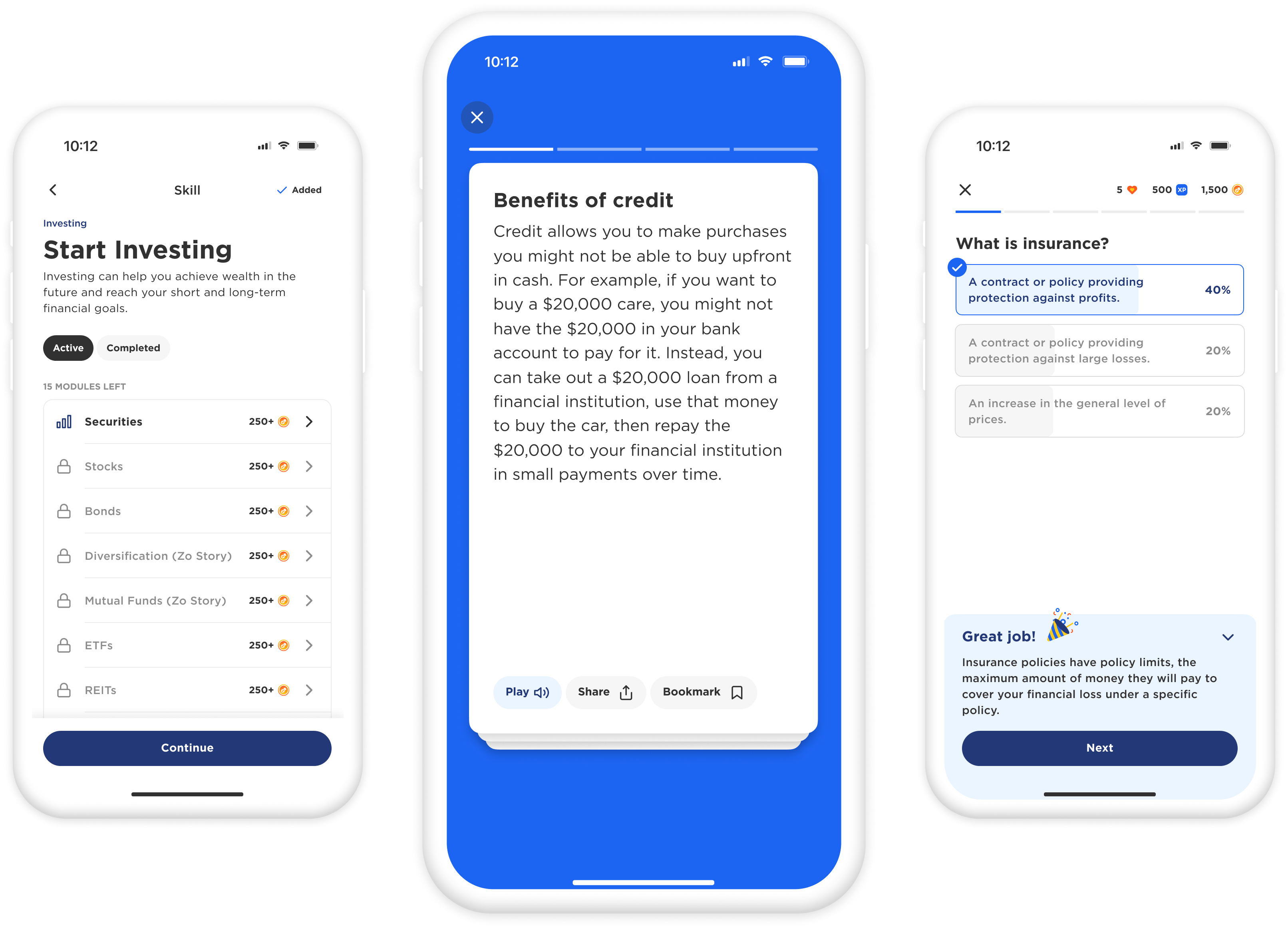
OVERVIEW
Zogo’s app delivers financial literacy education through short, interactive lessons. However, the previous interface felt cluttered, and some content elements lacked cohesion, disrupting the learning flow. This redesign aimed to refine the user experience, ensuring that learning feels engaging.
MY ROLE
Responsible for research, design, user testing, and delivery.
THE TEAM
Product Designer
Product Manager
(3) Engineers
(2) Customer Success
DURATION
3 weeks
THE PROBLEM
Users struggle to stay engaged due to a disjointed flow and branding that lacks professionalism for partners and appeal for younger users.
How might we create a seamless, engaging learning experience that balances professional credibility with youthful appeal?
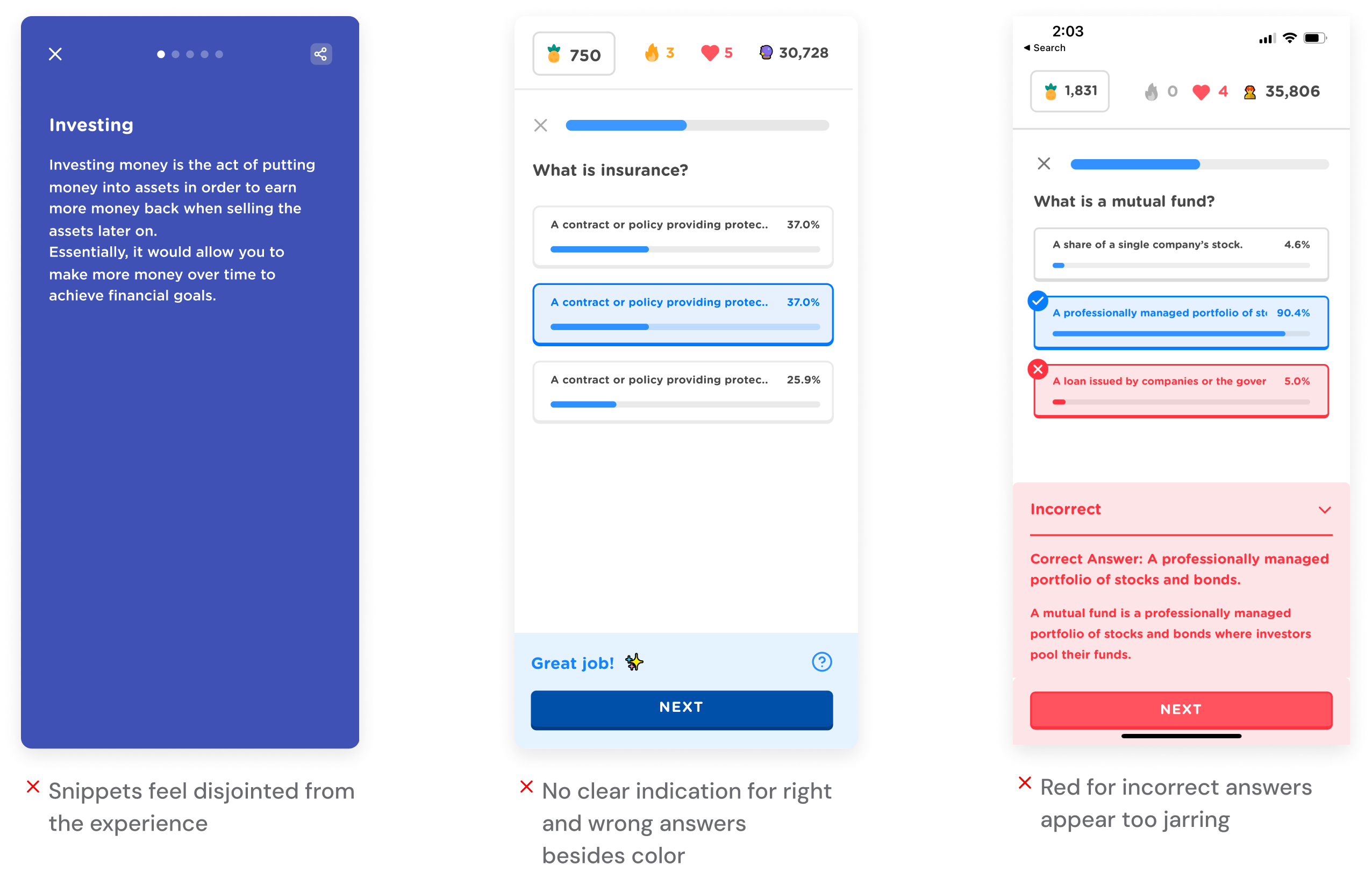
Existing experience
- Visual Overload: A cluttered interface impacted user focus and engagement.
- Fragmented Learning Flow: Disconnected content elements made the learning experience feel fragmented.
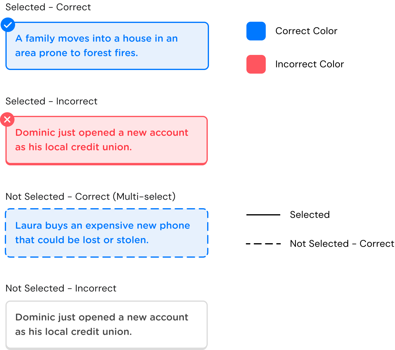
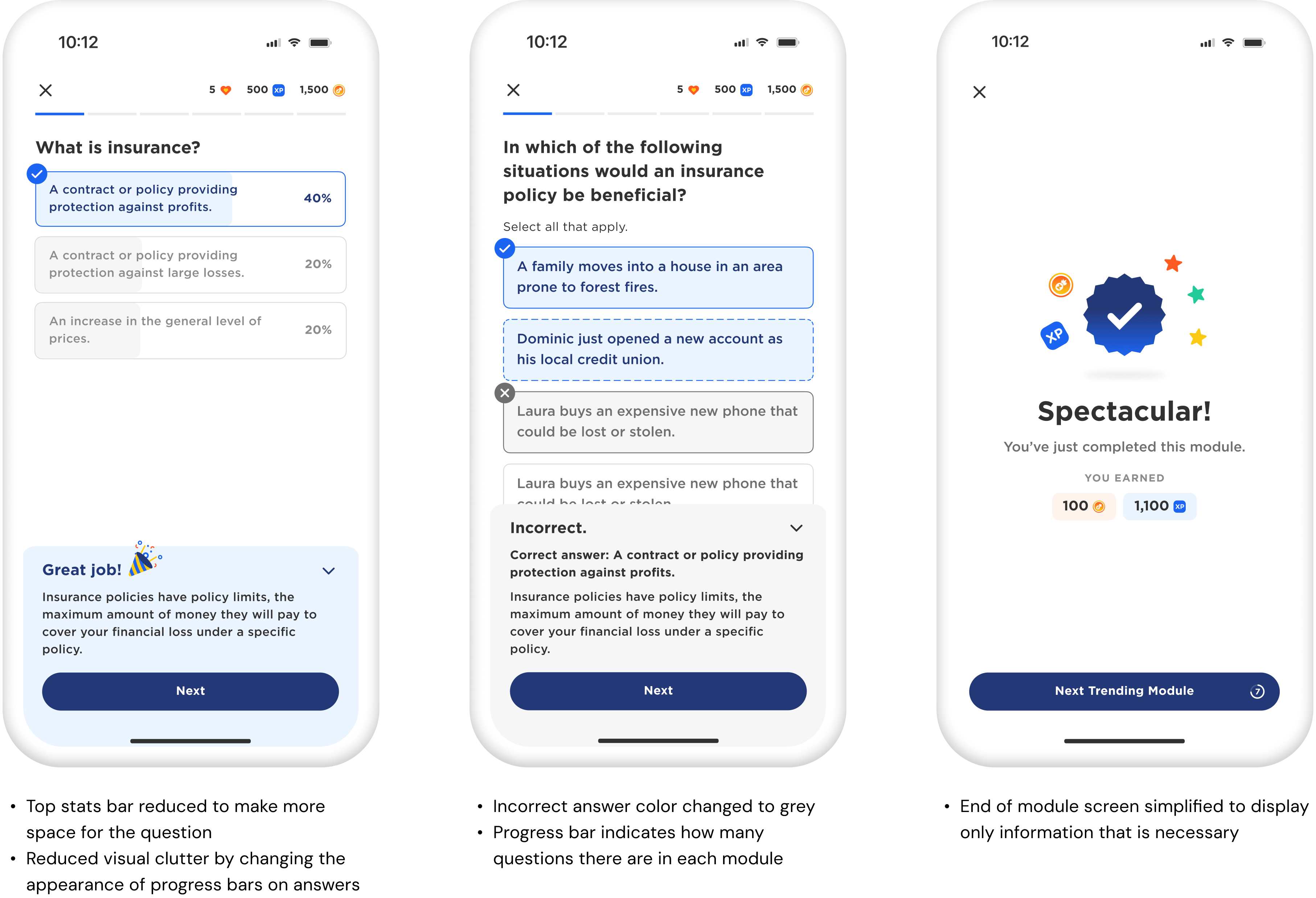
Making feedback easier to understand
I improved the feedback system for correct and incorrect answers by adding clear visual cues, helping users understand their responses for multiple-choice and multi-select questions. We went through several iterations, testing variations in line style and color to find the best way to convey different outcomes.
FINAL VERSION
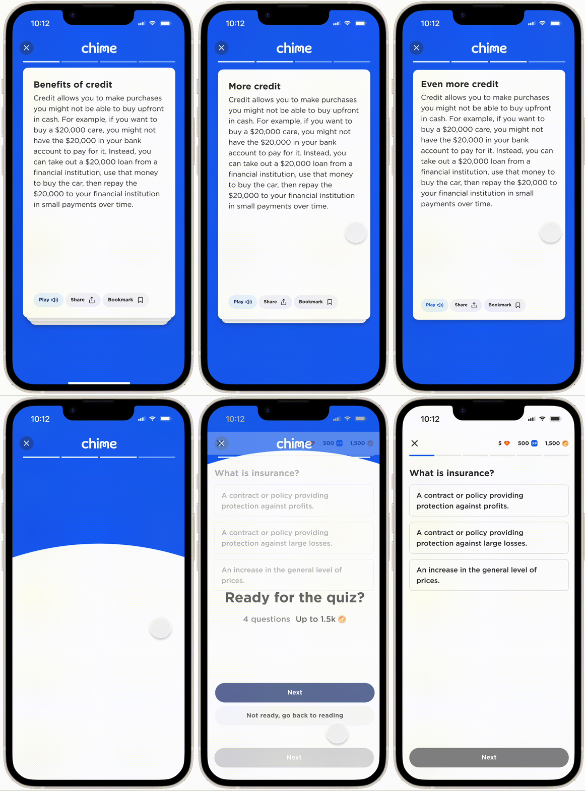
Transforming Snippets into Interactive Flashcards
I redesigned learning snippets as interactive flashcards, incorporating micro-interactions. This tactile experience encouraged users to progress through content in a way that felt natural and satisfying.
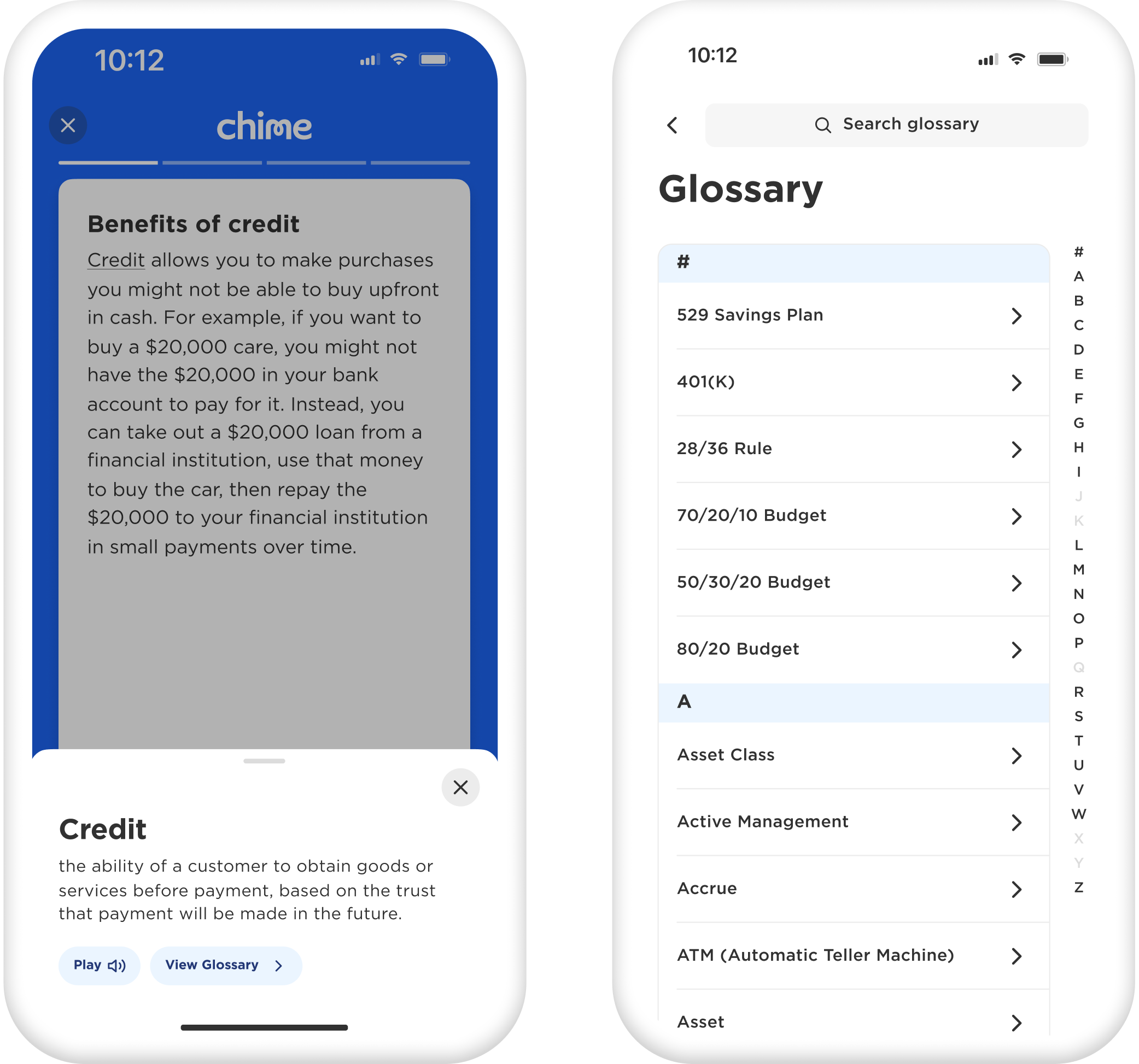
Glossary Integration
To maintain the learning flow, glossary terms were integrated directly into the experience, allowing users to tap on unfamiliar words for instant definitions. Each term also links seamlessly to the full Glossary in the Toolkit for further exploration.
FINAL ITERATION
Creating a clean, professional, and playful interface for partners and younger users
BUSINESS IMPACT
Increased user engagement
The new interactive flashcards and feedback system created a more fluid learning experience, encouraging users to spend more time in the app.
Improved clarity in learning flow
Partners found it easier to access and understand engagement metrics, which led to a 10% increase in the number of partners using the analytics feature.
NEXT STEPS
More content format explorations!
We’re focused on enhancing engagement and user retention by testing new question formats and adding more interactive, gamified elements. Additionally, we aim to personalize the learning experience further, ensuring content remains relevant and dynamic for all users. Ongoing user feedback and data will continue to drive these improvements.

let's chat!
thanks for scrolling! ‧₊˚✩彡