ZOGO
Streamlining Zogo's Partner Portal for growth and efficiency

OVERVIEW
Zogo is a financial literacy app that delivers content through quick, bite-sized modules. The Partner Portal is Zogo’s dashboard, offering analytics, management, and customization tools to its partners, including institutions, banks, and credit unions.
Despite its potential, partners found it challenging to navigate and utilize the Partner Portal effectively.
I led the redesign of the Partner Portal, streamlining processes and enhancing customization tools. The initial release received positive feedback from both our customer support team and partners.
MY ROLE
Sole designer responsible for research, design, user testing, and delivery.
THE TEAM
Product Designer
Product Manager
(3) Engineers
(2) Customer Success
DURATION
Over a 6 month period
THE PROBLEM
As Zogo’s partnerships expanded, the system struggled to scale. Partners had difficulty navigating multiple tools, with analytics, marketing materials, and customization options spread across different platforms. This fragmented setup led to inefficiency and frustration, emphasizing the need for a more streamlined, unified system.
Inefficient workflows for customization
In Zogo's early days, with fewer partners, offering customized products was manageable. However, this became more complex as we grew to serve hundreds of partners. The existing process is too time-consuming for customer support to manage.
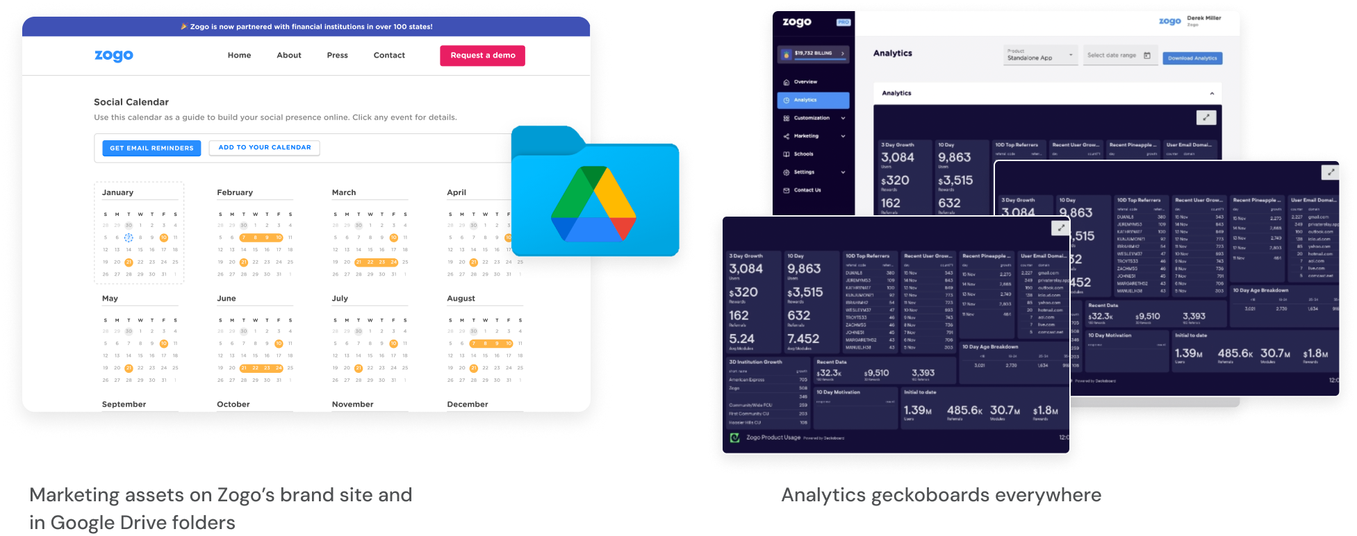
Fragmented analytics and resources
Partners often had to click through multiple tabs and external links to find the metrics they were looking for.
PROCESS
Tackling the problem
Now that we’ve identified the high-level issues, it was time to break down the massive redesign into manageable chunks. We tackled the designs in phases and prioritized what was causing the most issues.

PHASE 1
Reducing manual work for customer support
Zogo’s existing customization tools include Content Library and Custom Modules. In addition to these features, Zogo also allows Partners to add in survey questions and affiliate links to their content. There was no existing tool for these features and was done gathering info manually from partners.
⭐ INITIAL PROPOSAL
Streamline and add everything into one tool, but we had to keep tools separate due to technical constraints and effort. Building the tool from the ground up would be an unwieldy task, so the tools were kept separate and I ensured flows were similar to reduce friction when learning.
Content Library
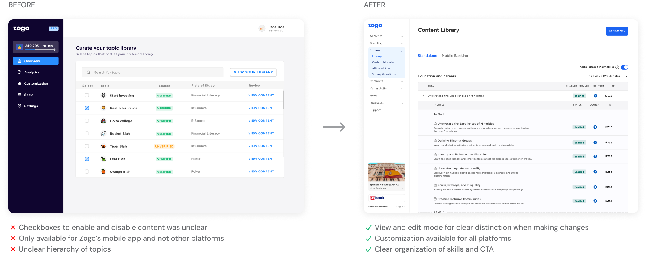
I designed a robust Content Library that allowed partners to enable or disable content at will. This empowered them to control what users saw, without needing to rely on customer support.
Custom Module
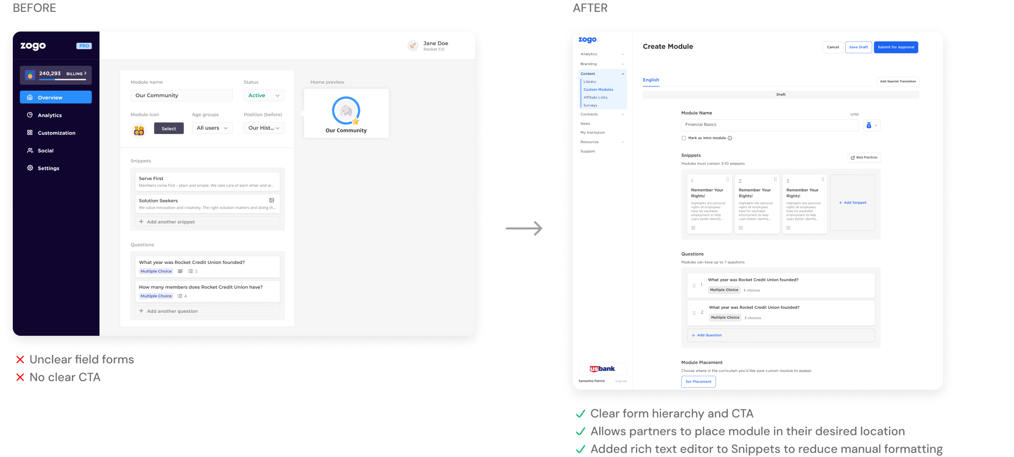
Zogo's Custom Module tool allowed partners to create their own modules that would appear in Zogo's learning platforms. However, the tool did not support placement (where the module would appear).
Adding new features
Previously, affiliate links and survey questions were added manually. I designed tools that followed the custom modules' patterns, allowing partners to manage content without customer support.
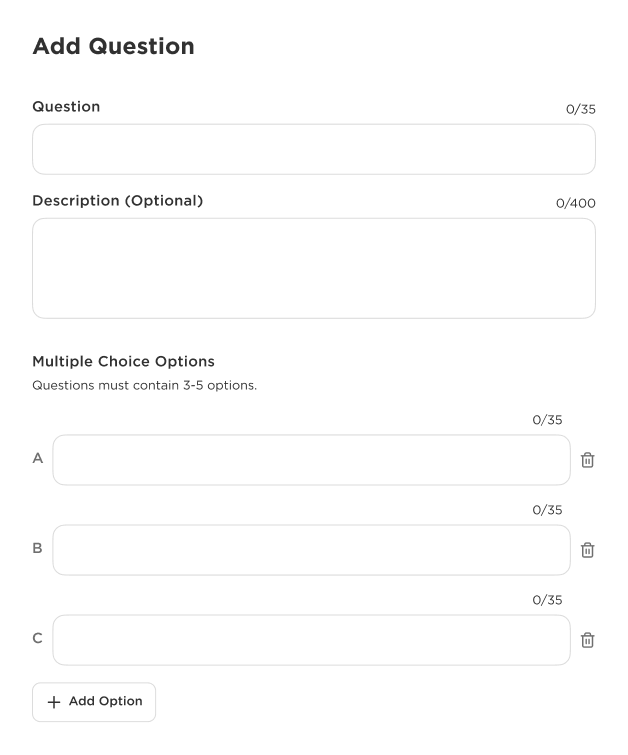
Survey Questions
Survey questions followed the same format as the Custom Module tool, simplifying the customization process for partners.
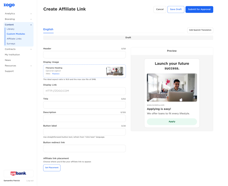
Affiliate Links
Affiliate link placement follows the same modal flow as Custom Modules. I added a preview feature to give partners a clearer understanding of how their affiliate links will appear in their products.
PHASE 2
Consolidating resources for partners
Analytics were available in the Partner Portal, but alongside the general metrics, there were several external links to Geckoboard analytics. Marketing materials were also scattered across Google Drive folders and other external links. Consolidation was urgently needed.

Engagement Analytics
Analytics was revised multiple times as it served as the first page partners encountered. Partners wanted more filters and comparisons, like 30-day data instead of only all-time metrics. It was essential to design platform-specific views to display relevant metrics for each partner.
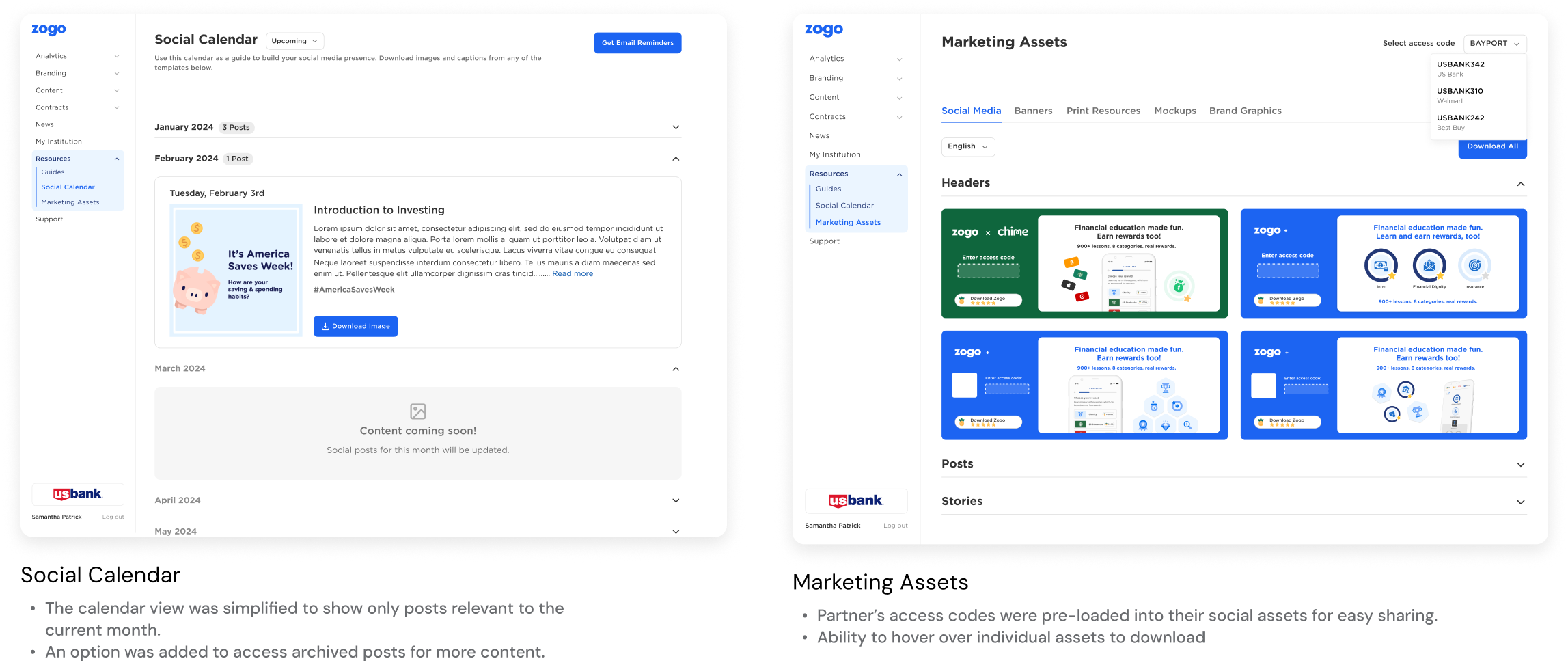
Marketing Resources
Marketing assets are crucial for our smaller partners who lack the resources to create their own. Partners consistently seek more ways to promote their brand and Zogo. Although many assets were scattered across various sites, I conducted an audit and implemented changes to simplify the process.
PHASE 3
Streamlining partner communication
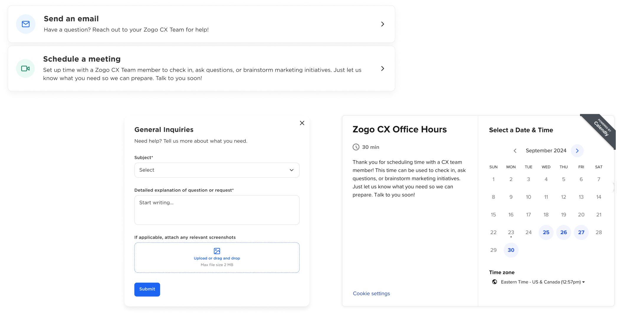
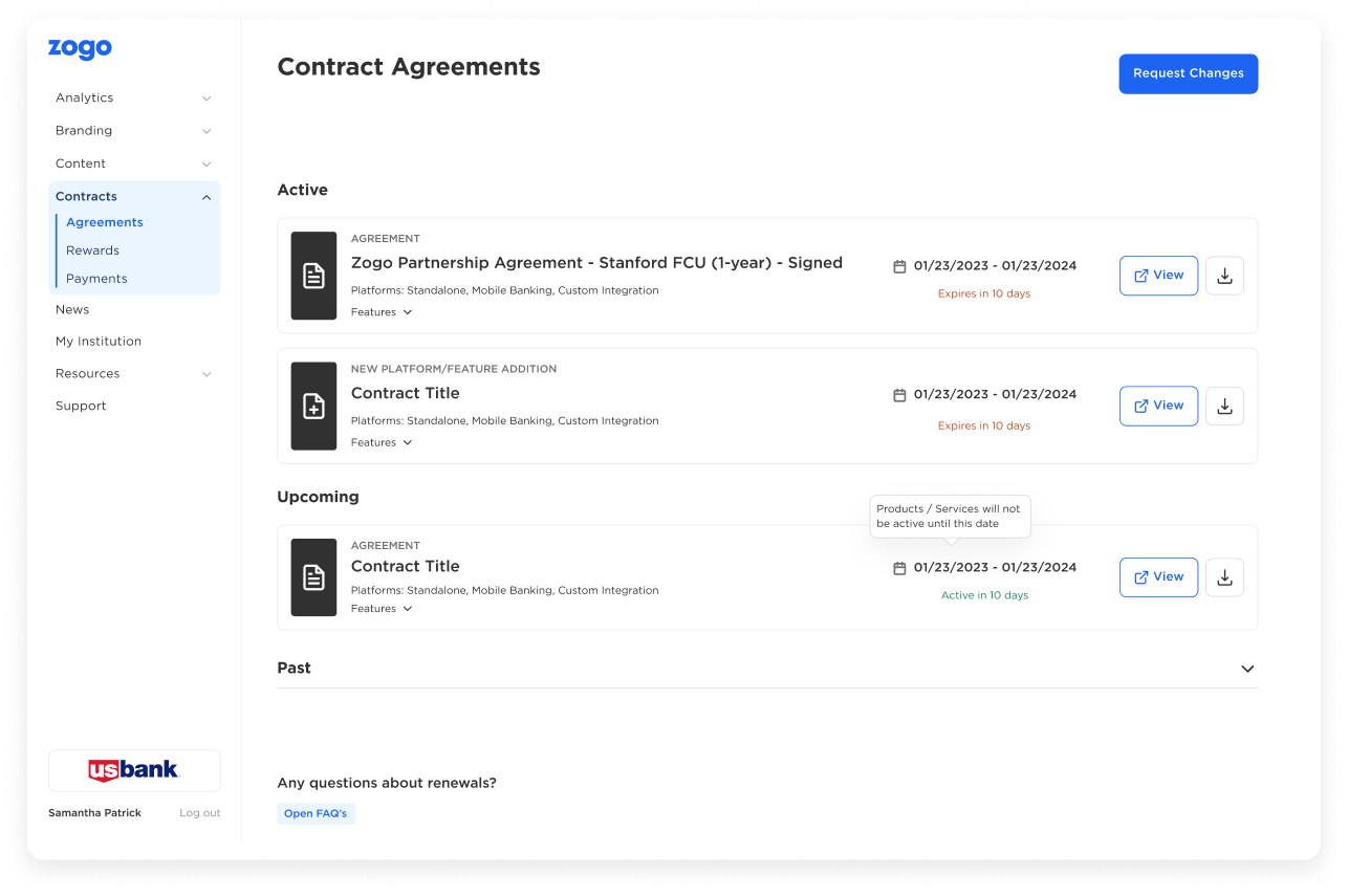
Managing contracts
Currently, there is no existing tool to view a Partner's contract. Partner's found it valuable to keep track of existing agreements when the time comes for renewal.
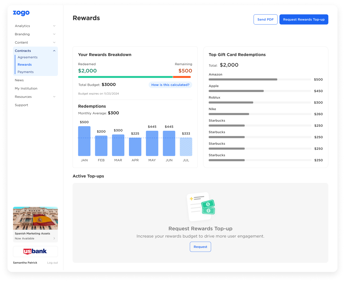
Tracking rewards
Each Partner had a rewards budget as part of their contract. Results from surveys showed that Partners wanted better breakdowns of their rewards budget and where their money was being allocated.
BUSINESS IMPACT
Reduced customer support requests
Partners were able to make customizations on their own, which decreased support requests related to these tasks by 30%.
Improved engagement tracking
Partners found it easier to access and understand engagement metrics, which led to a 10% increase in the number of partners using the analytics feature.
Higher partner satisfaction
Feedback from partners indicated a significant improvement in their overall experience with the dashboard, with many noting that it felt more intuitive and user-friendly.
NEXT STEPS
Update remaining pages
Most Partner Portal pages have been updated to the new UI style, but less-used pages like account settings and info still need to be refreshed. Maintaining visual consistency across all pages is crucial for a cohesive experience. It reduces confusion, reinforces brand identity, and prevents the platform from feeling disjointed.

let's chat!
thanks for scrolling! ‧₊˚✩彡
